


Our design process began with a thorough research and discovery phase. During this stage, we delved into the client's vision, analyzed the competitive landscape of book apps, and conducted audience research to gain a comprehensive understanding of user needs and preferences. This meticulous investigation provided us with a strong foundation for crafting a tailored and effective design solution.

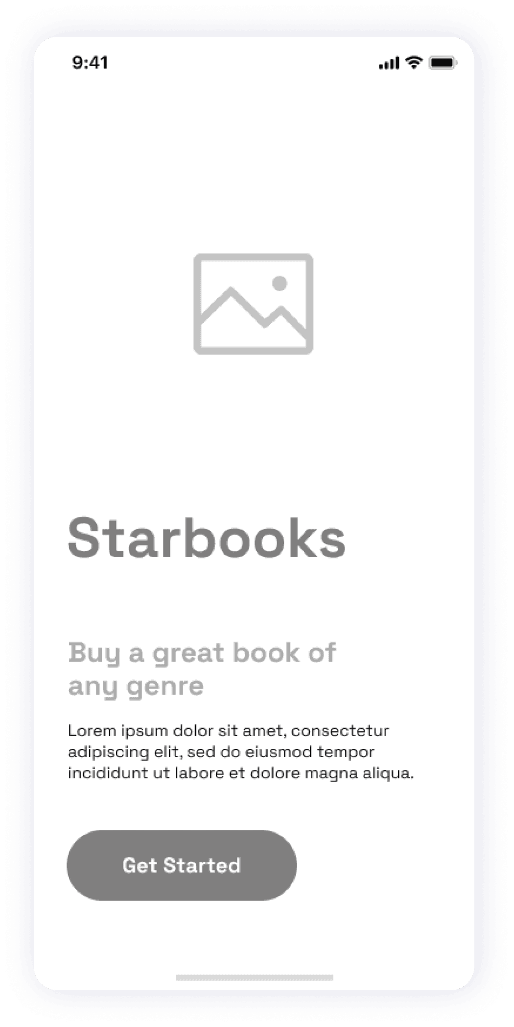
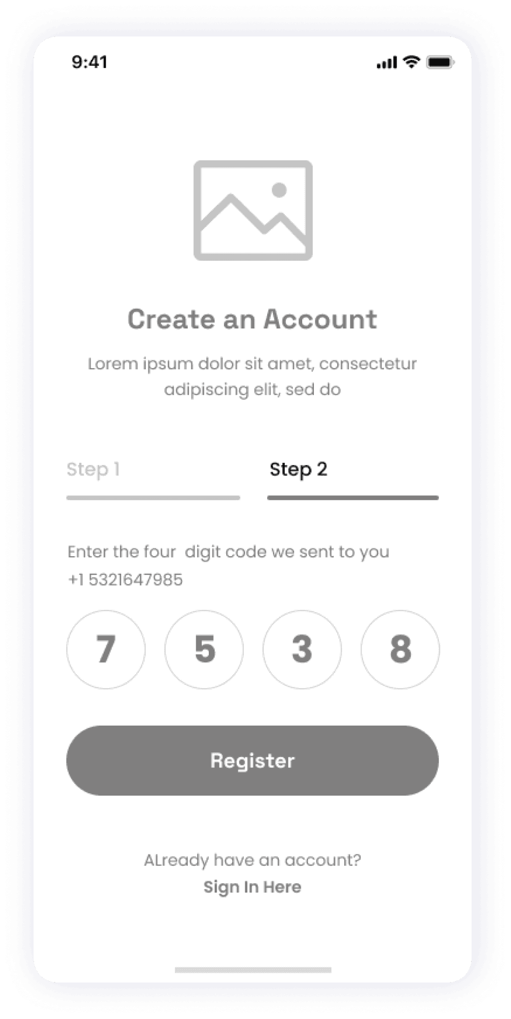
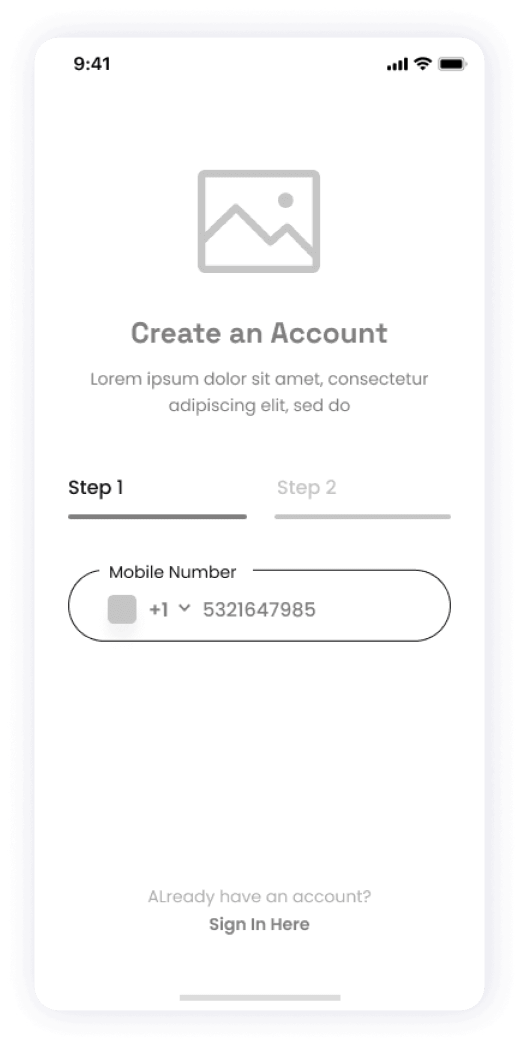
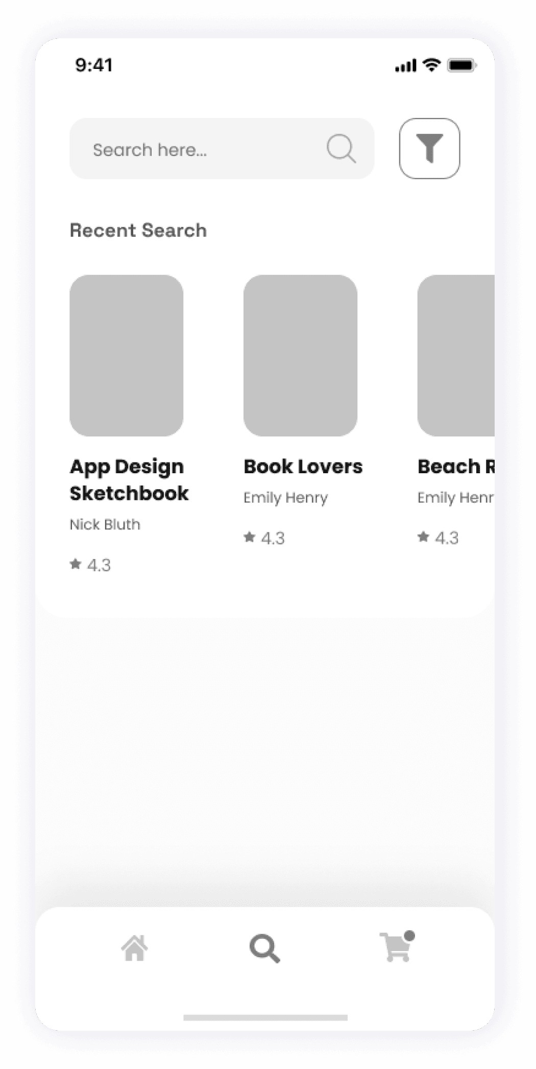
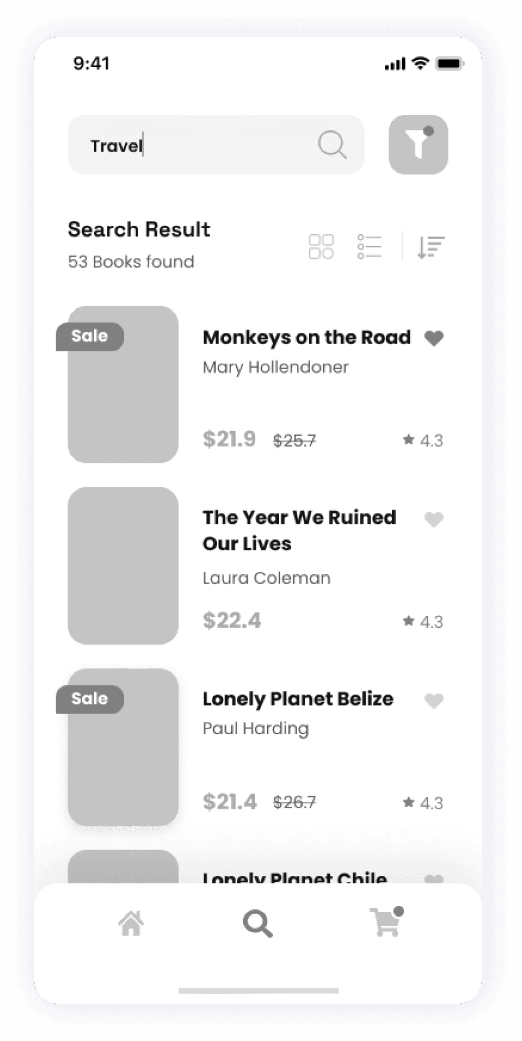
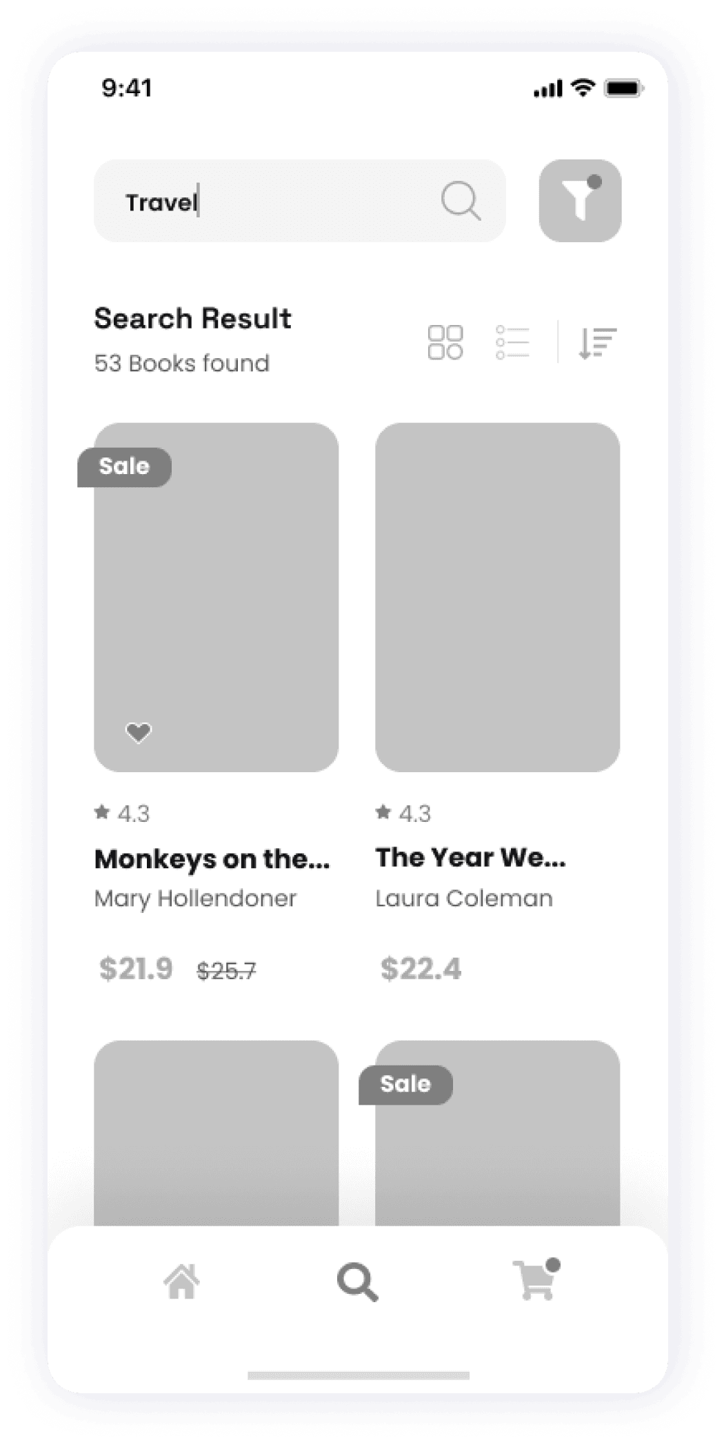
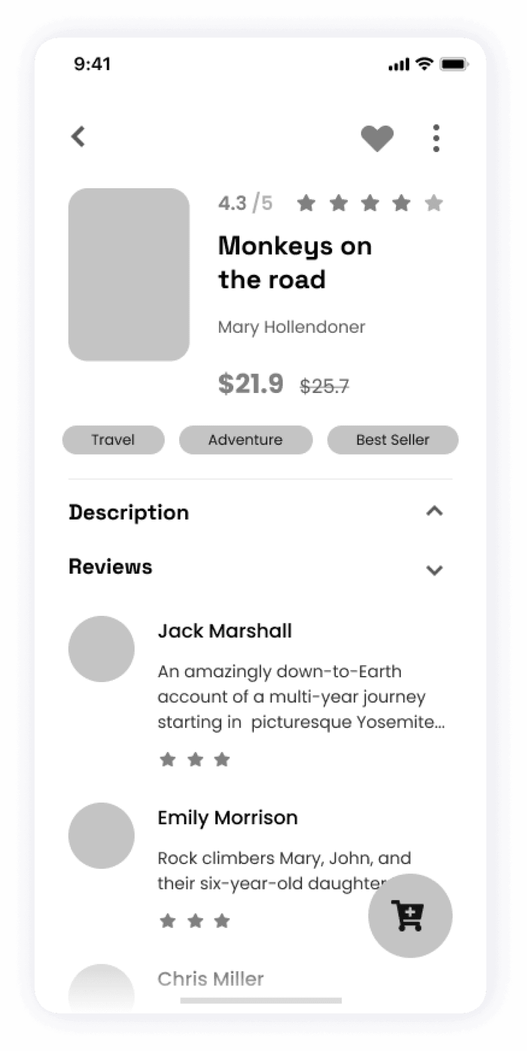
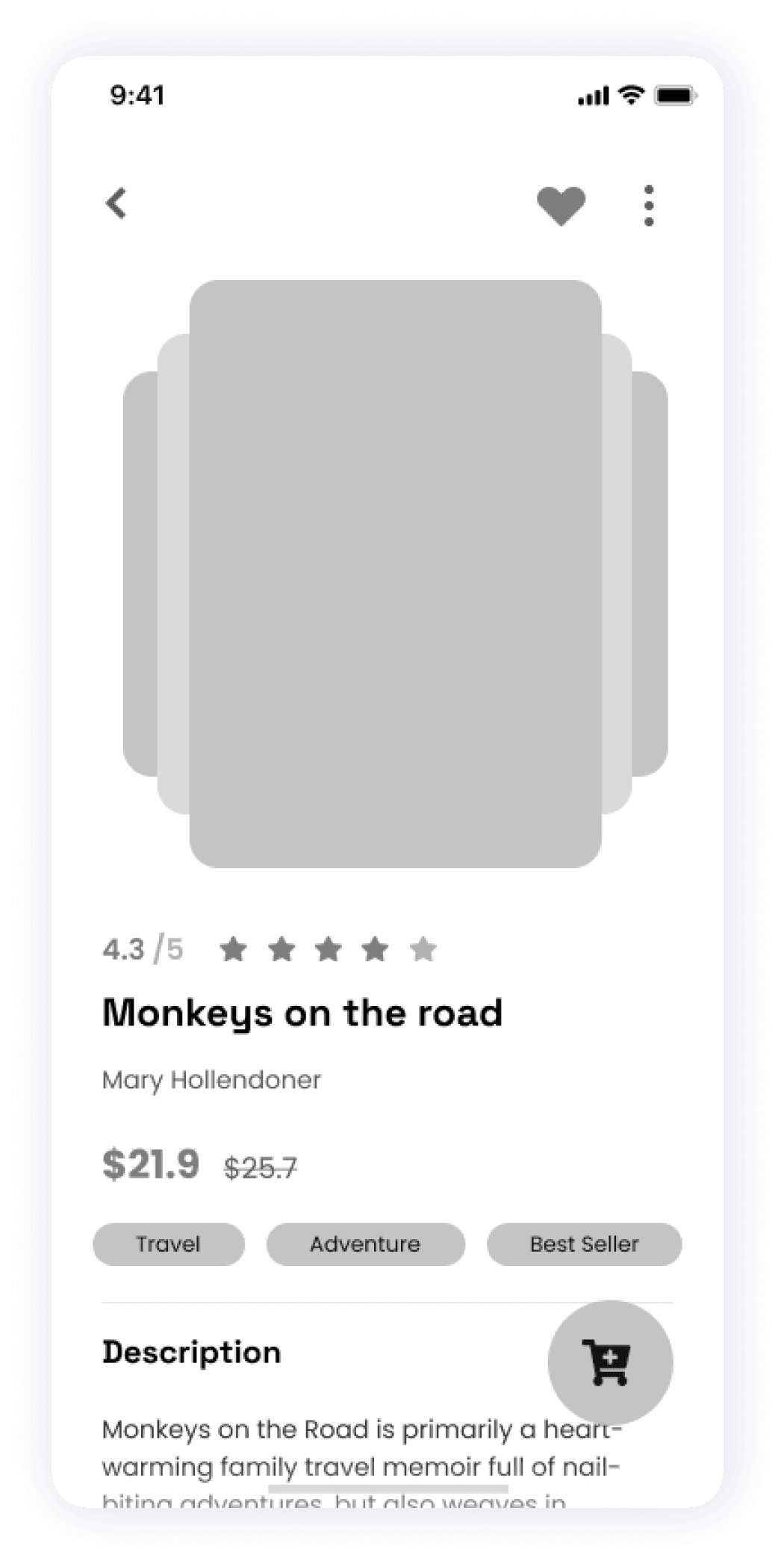
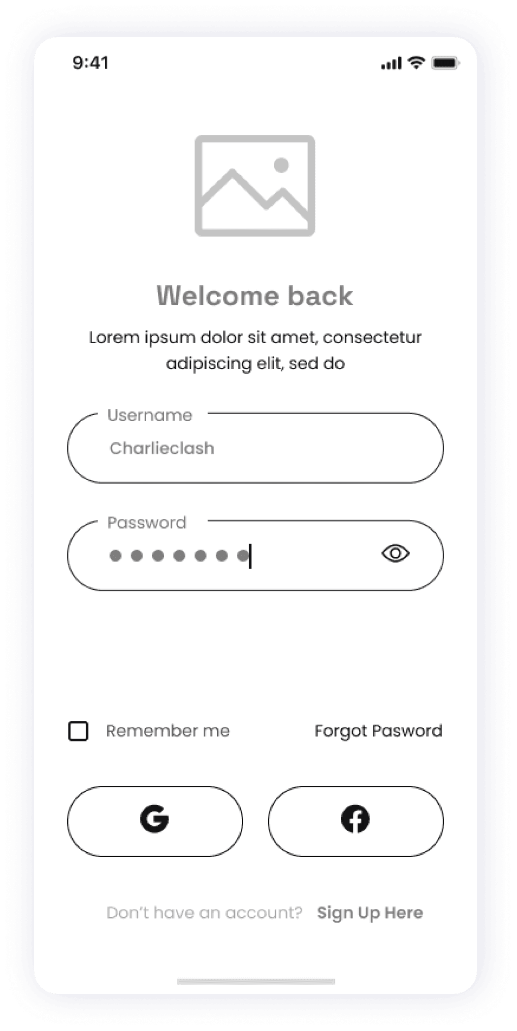
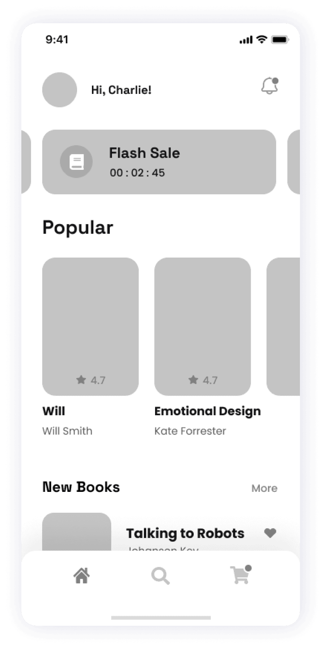
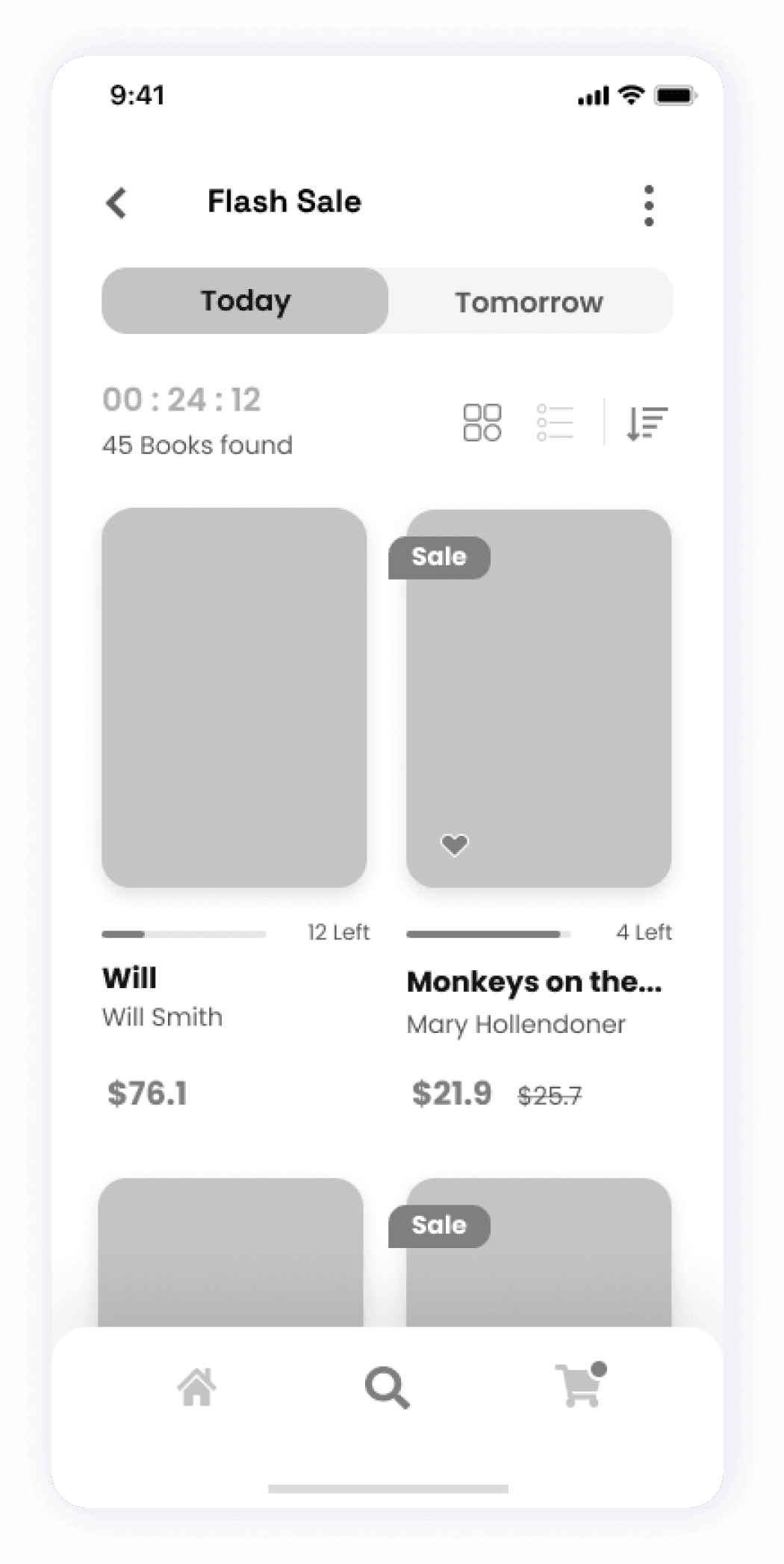
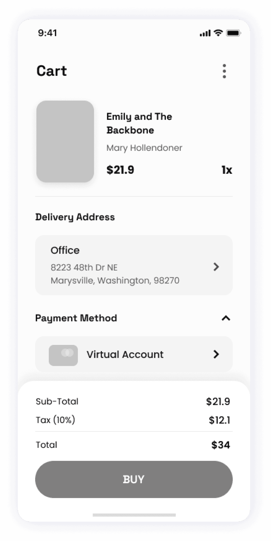
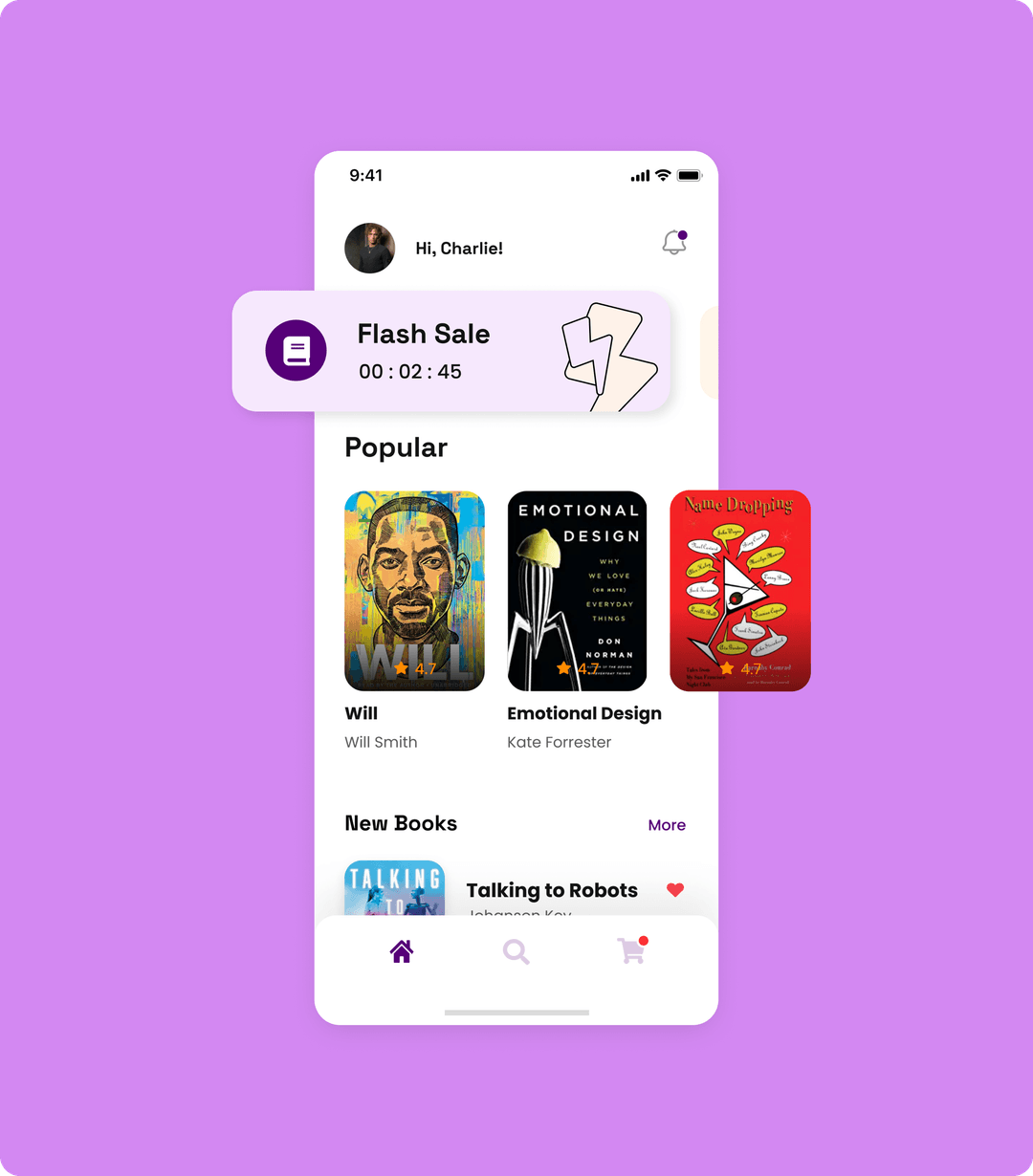
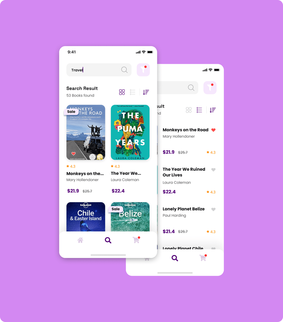
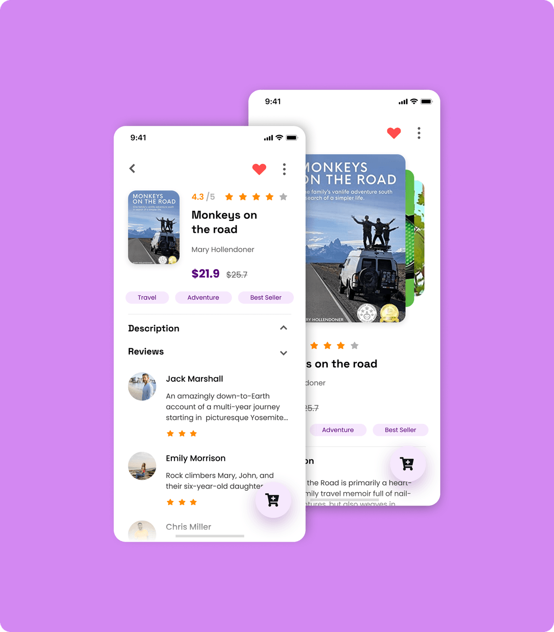
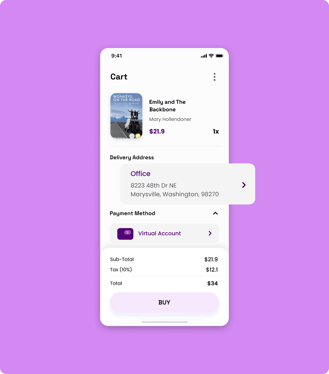
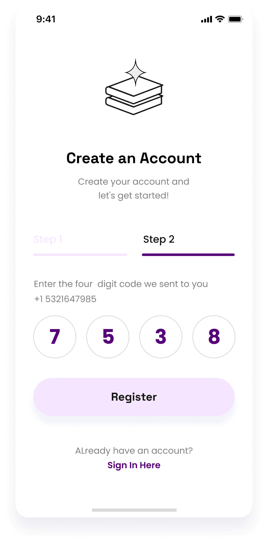
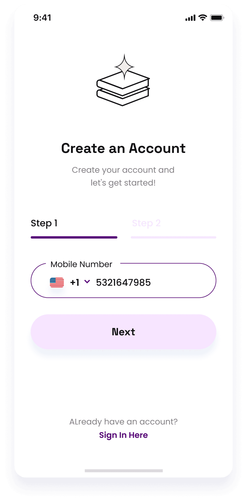
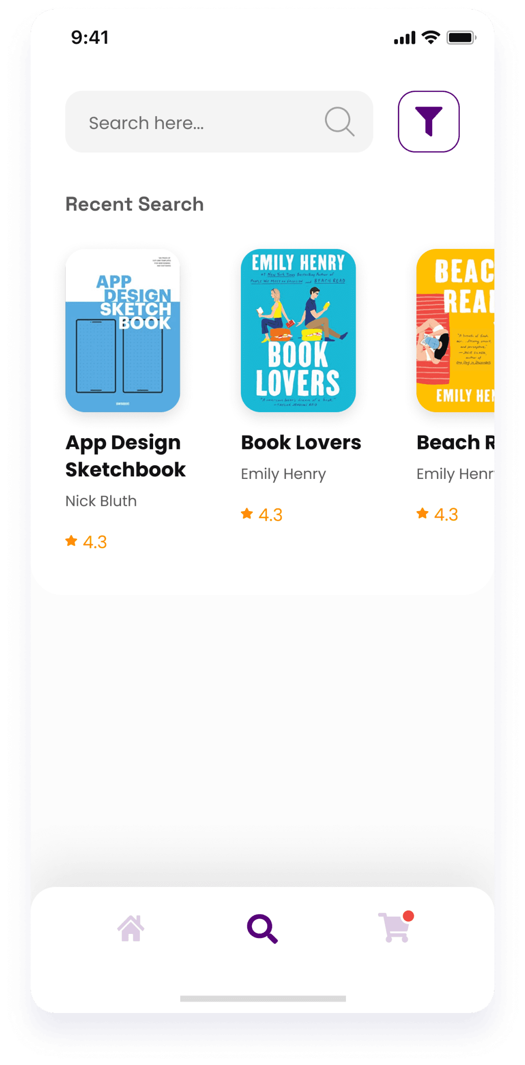
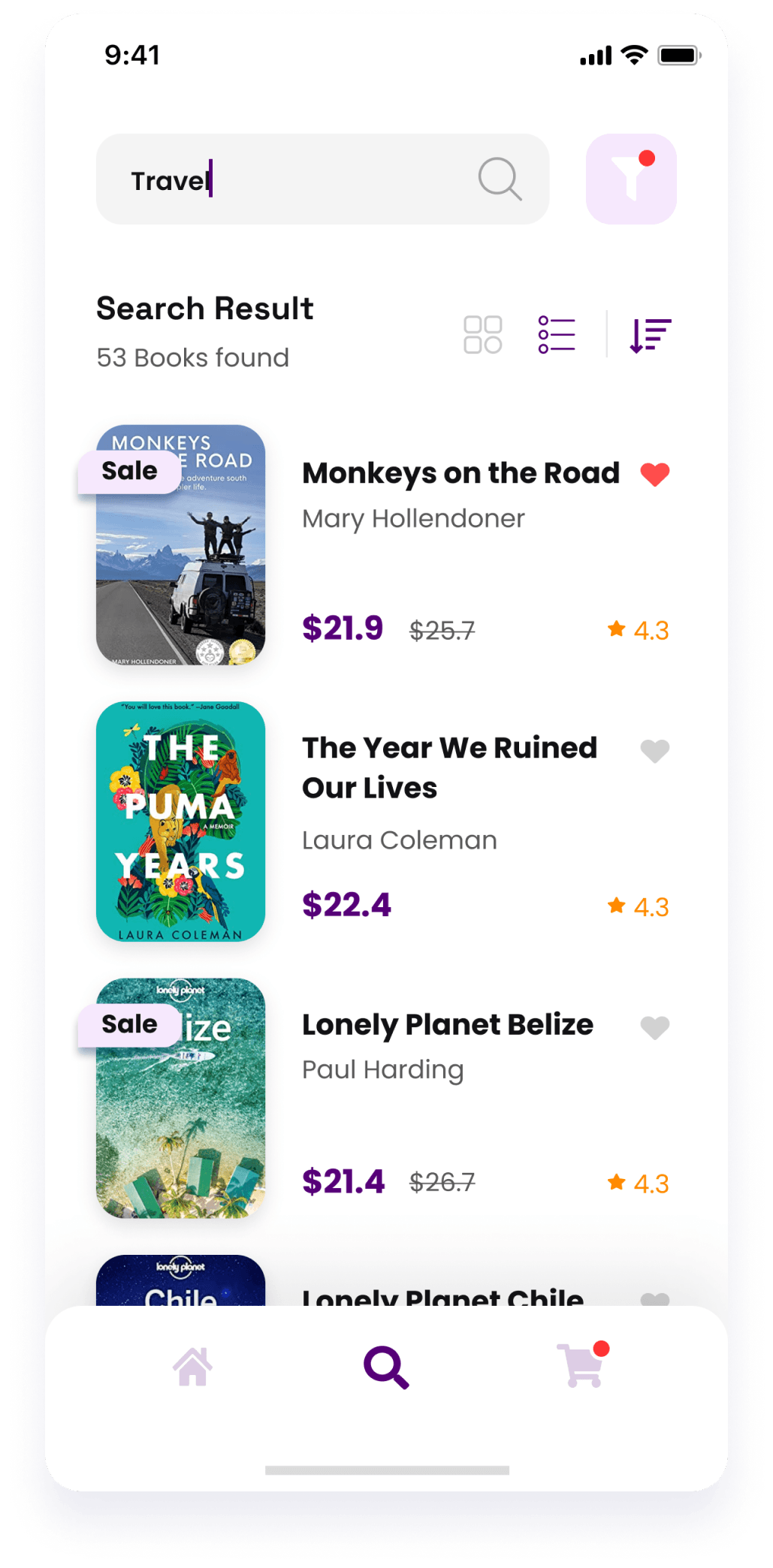
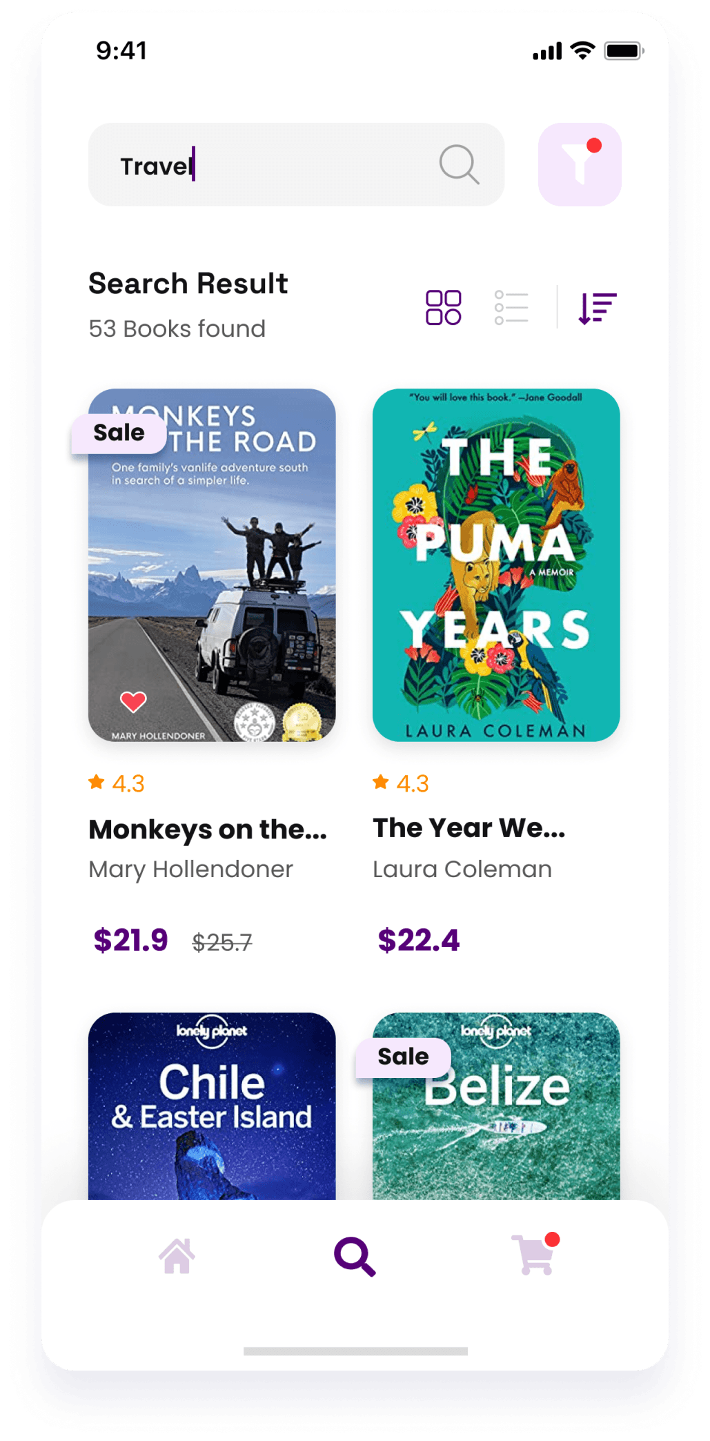
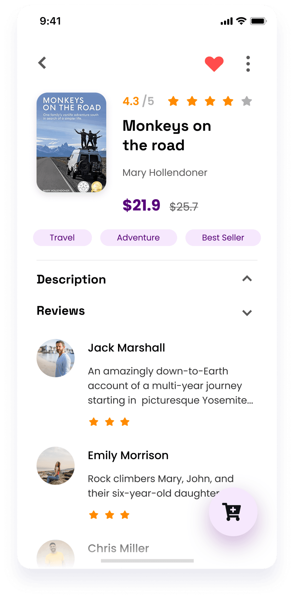
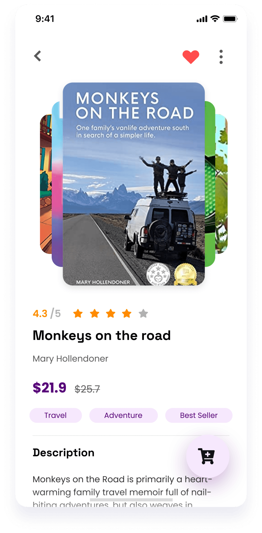
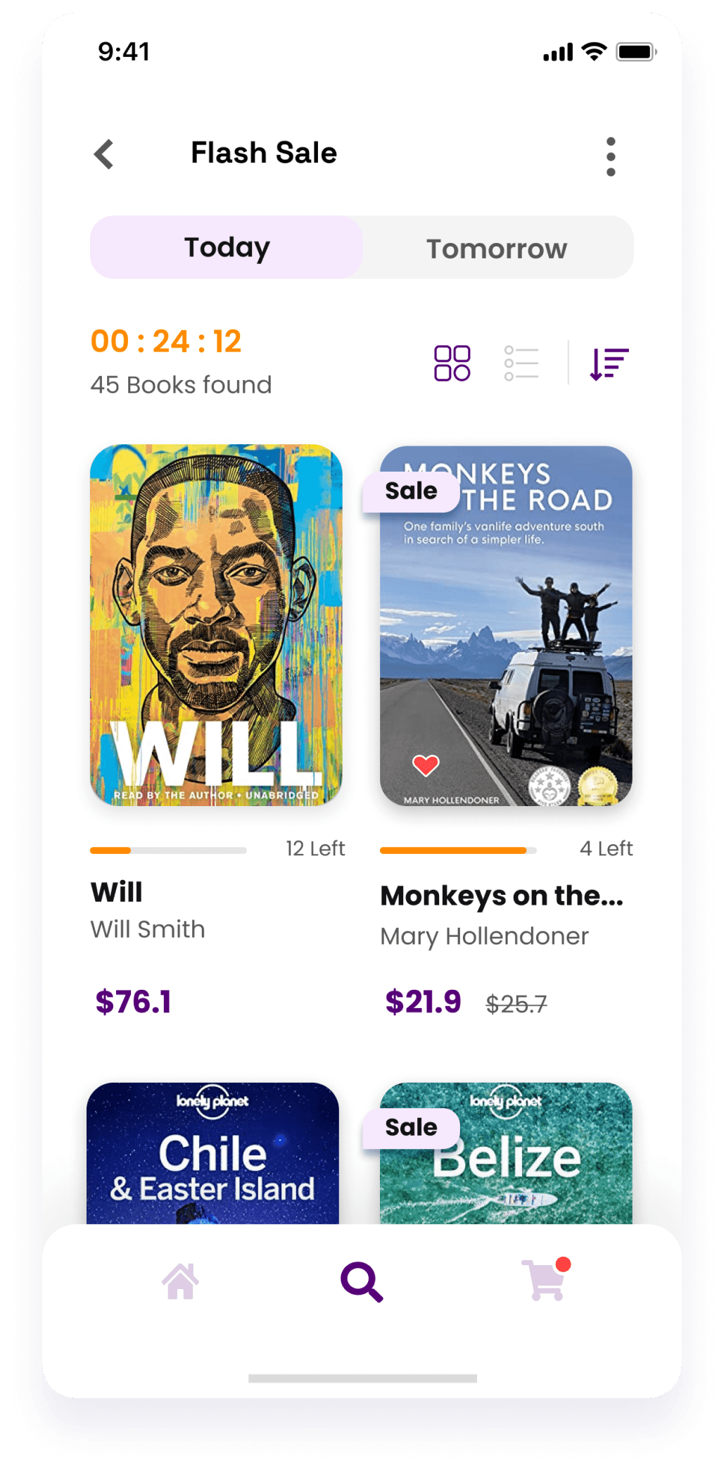
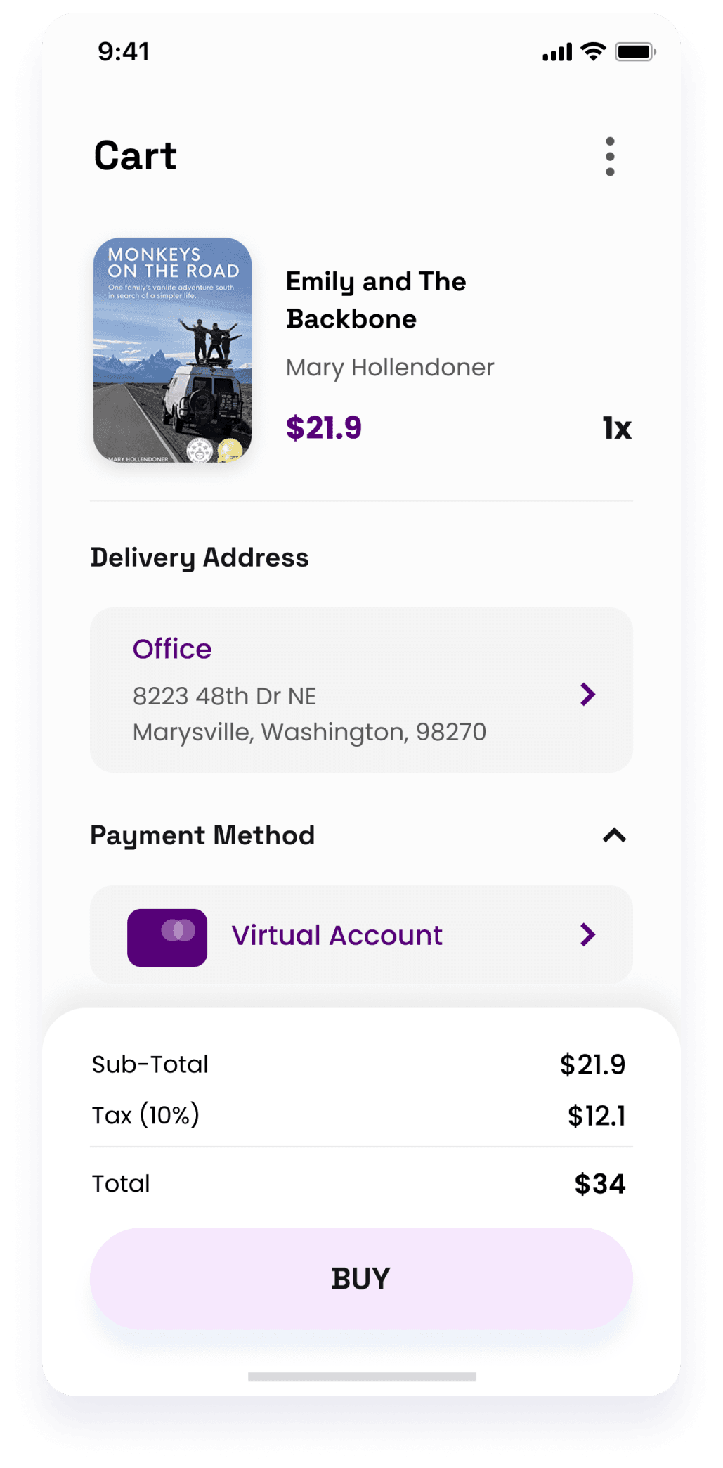
Once we had a solid grasp of the project requirements, we moved on to the wireframing stage. At this phase, we created numerous wireframes to visualize the user journey, from account creation to searching for books and adding them to the cart. These wireframes served as the foundation for the app's structure and functionality, ensuring a seamless and intuitive user experience.

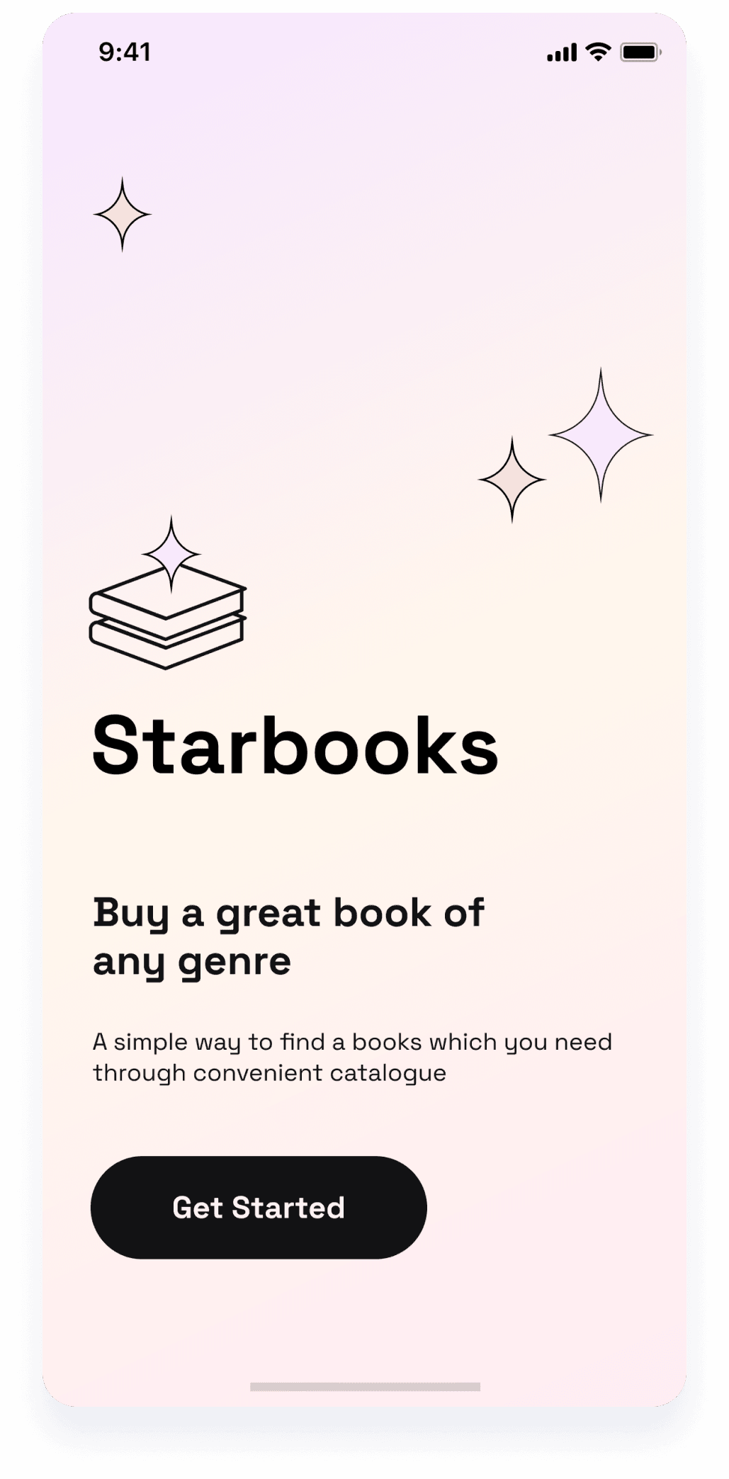
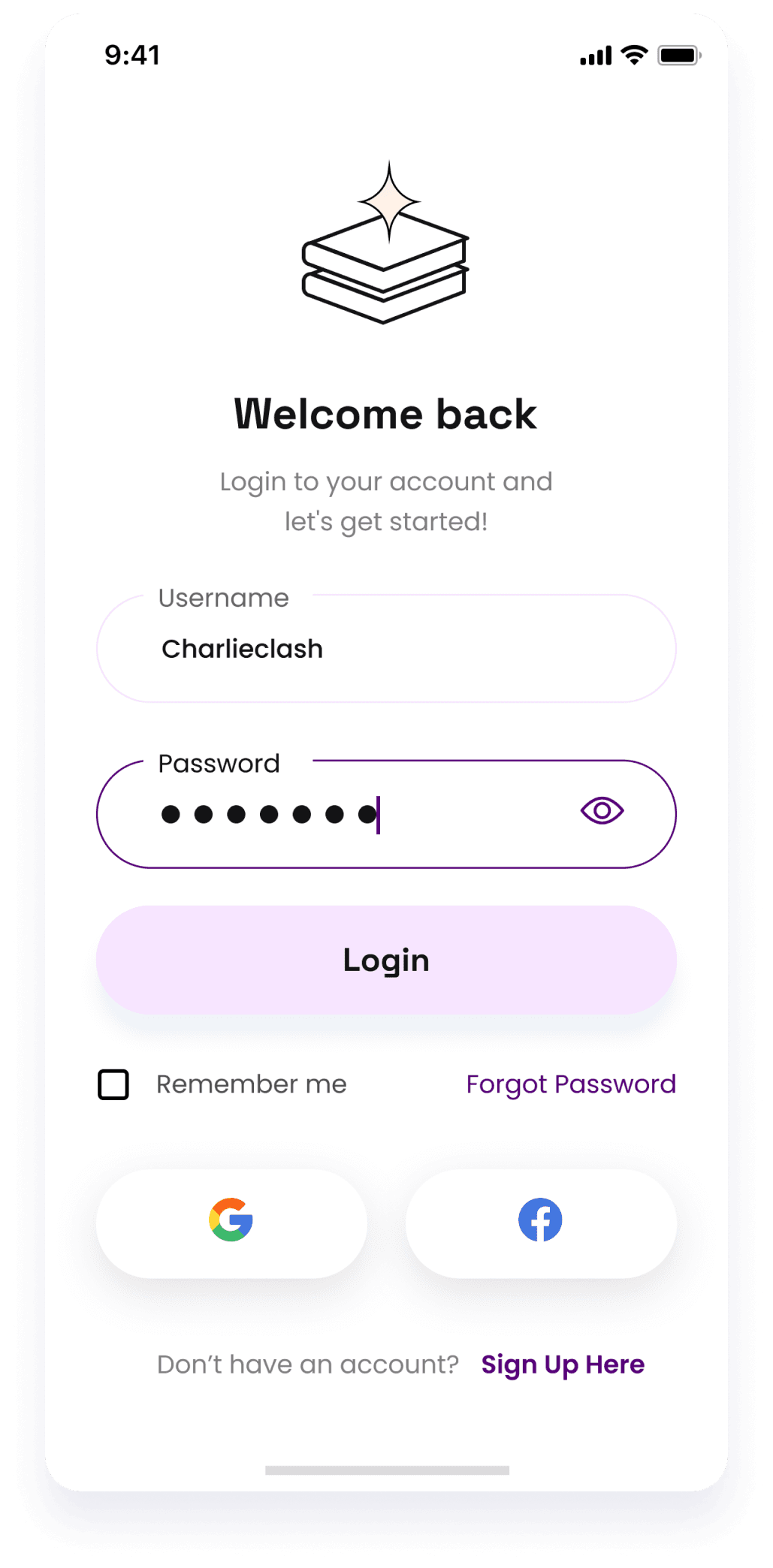
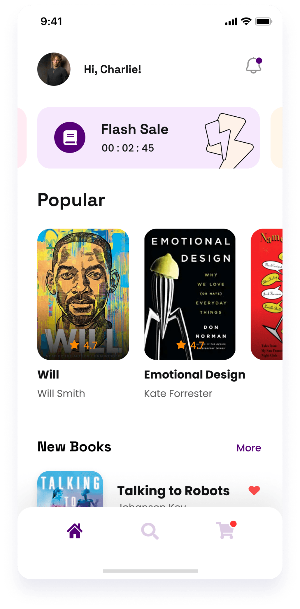
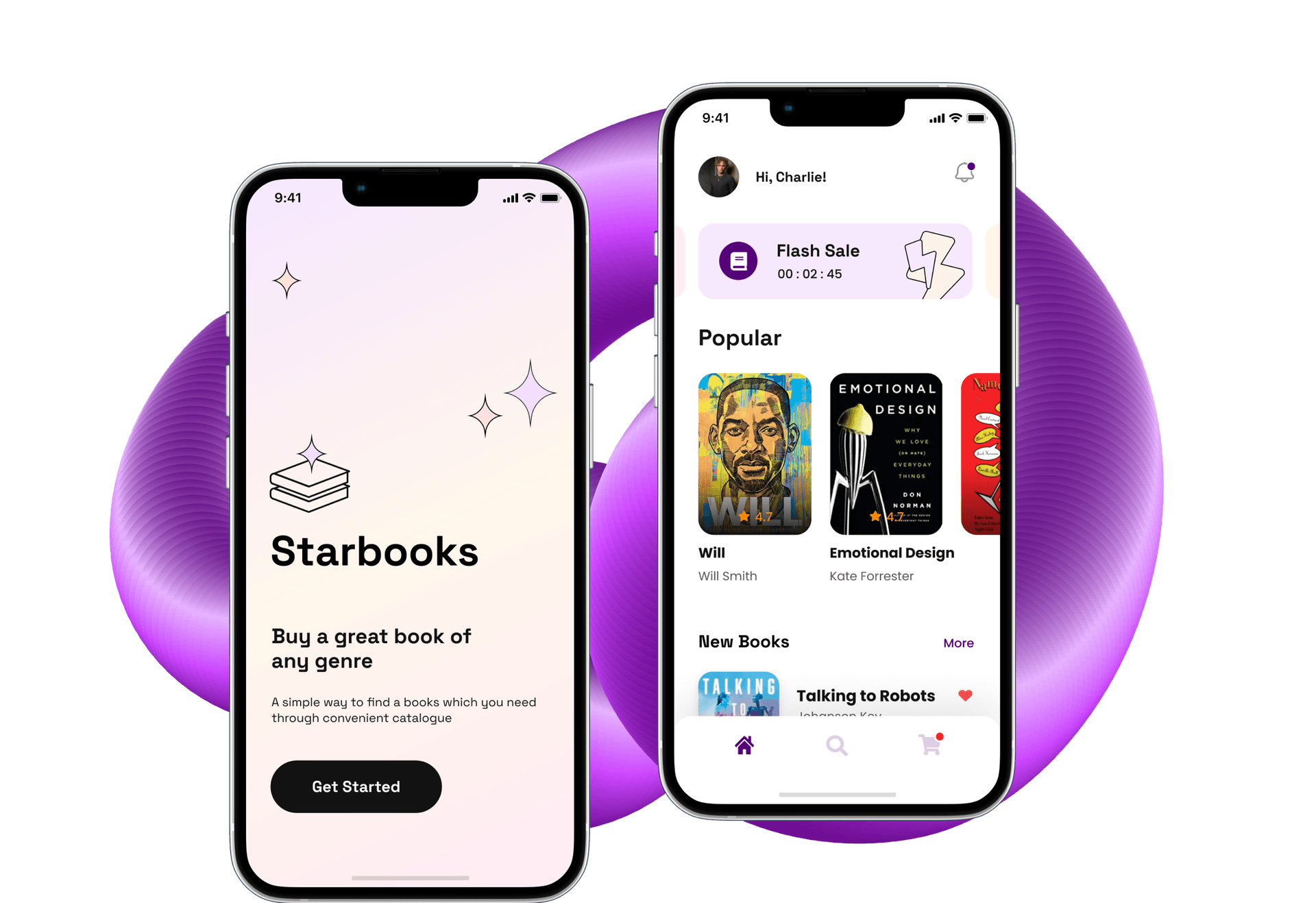
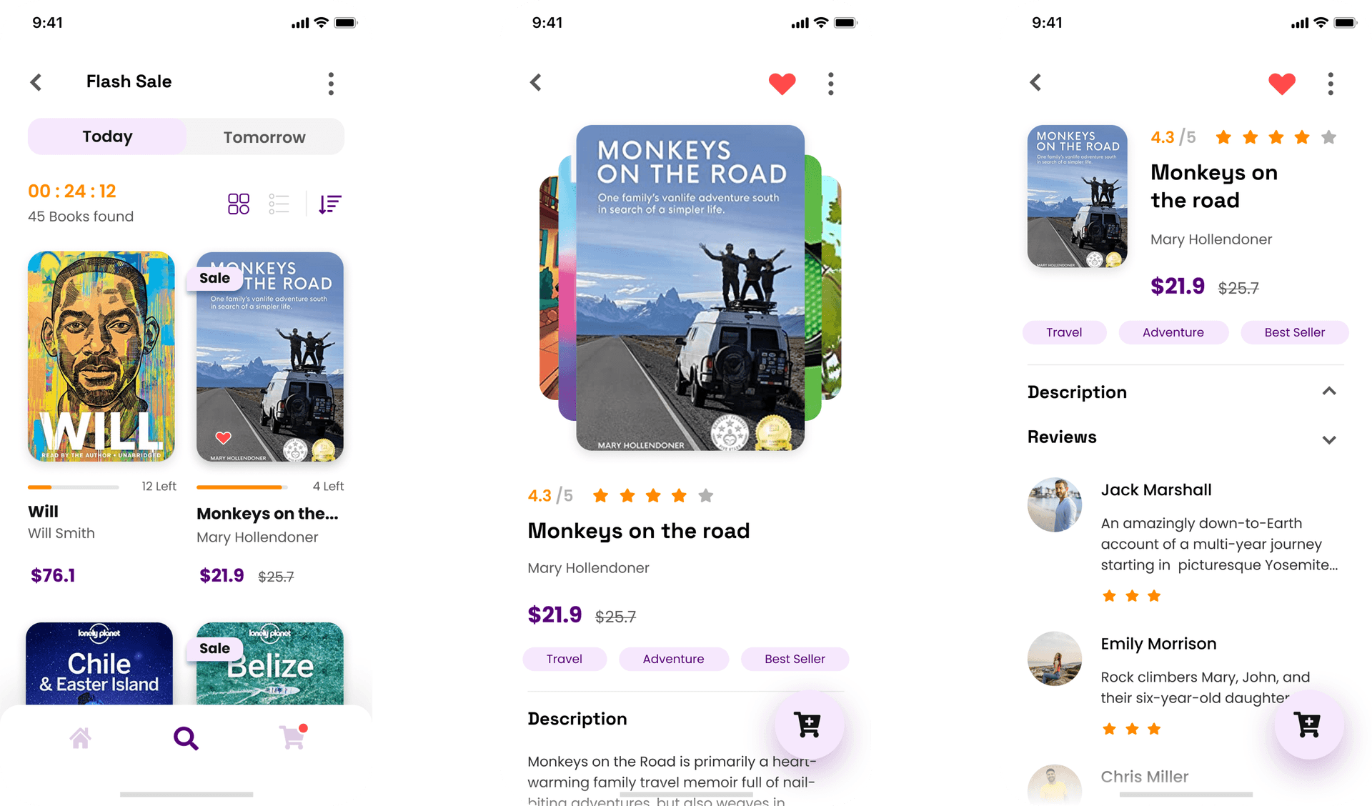
Once the wireframes were finalized, our team moved on to the UI design phase. At this stage, we translated the UX concepts into visually appealing and user-friendly interfaces. We carefully selected colors, fonts, and imagery that reflected the app's identity and appealed to the target audience. Additionally, we designed custom icons and illustrations to enhance the overall aesthetic and usability of the app.

Beyond the education app design services, we also took on the task of creating a distinctive logo for Starbooks. The logo features stacked books topped with a radiant sparkle, symbolizing the pursuit of knowledge and discovery. Paired with the app's name in a modern, clean typeface, the logo encapsulates the essence of Starbooks, making it both memorable and aligned with its mission.

To provide the client with a tangible preview of the final product, we developed an interactive prototype of the app. This prototype allowed the client to experience the app firsthand, navigating through its features as if it were fully developed. The feedback gathered during this phase was instrumental in refining the design before moving forward with development, ensuring that the app would meet the client’s expectations and deliver a superior user experience.