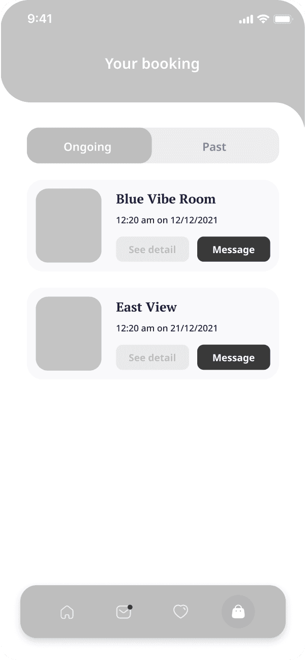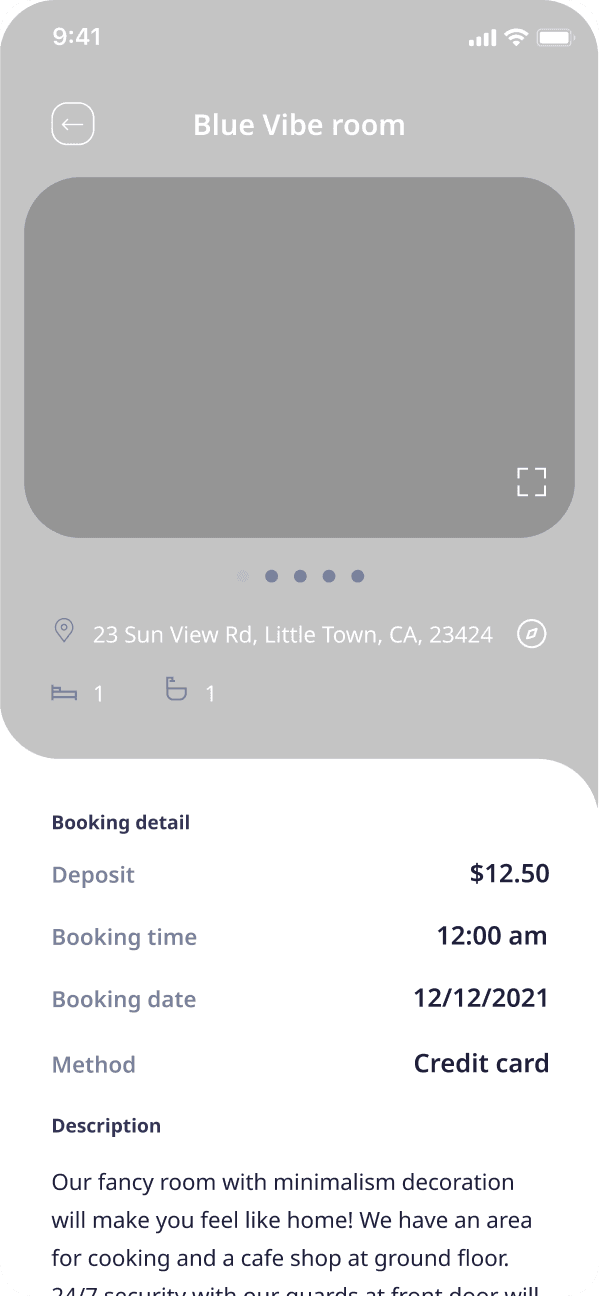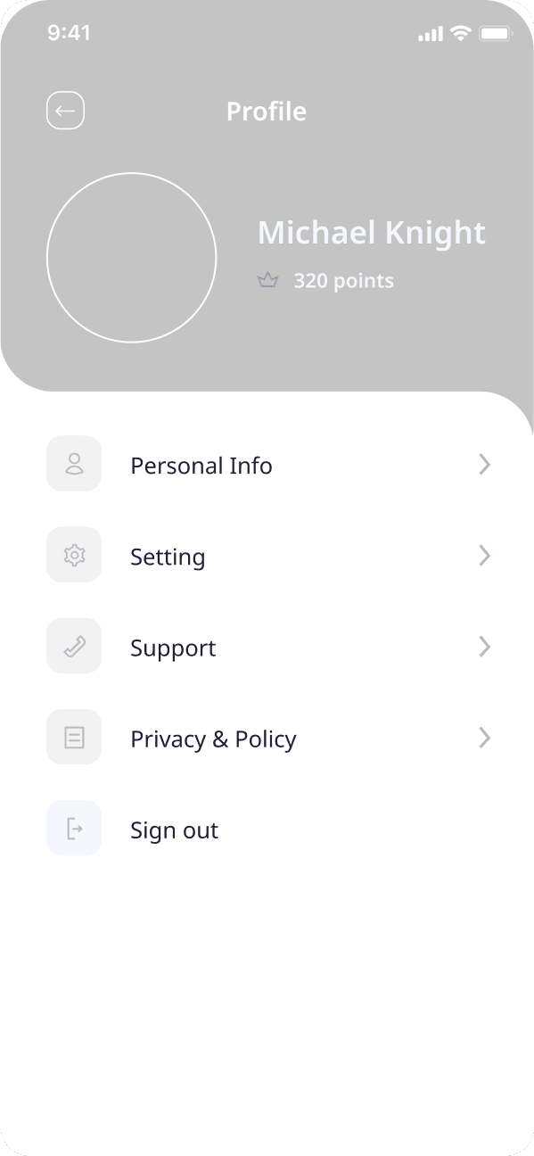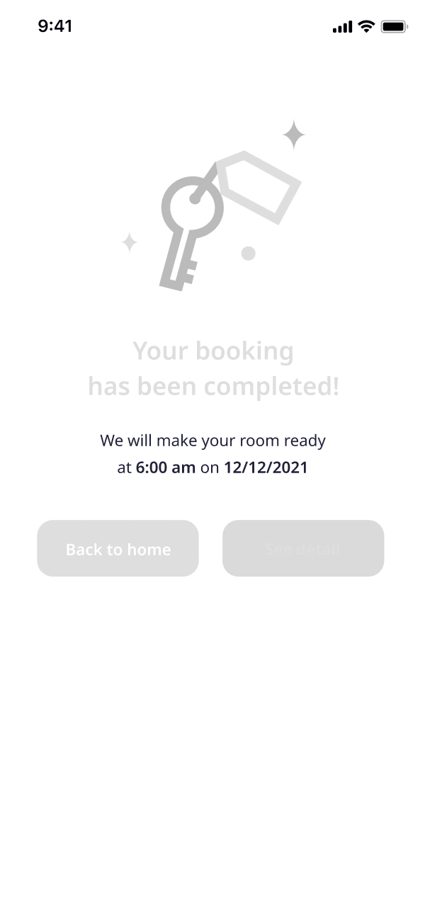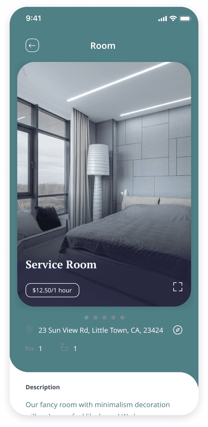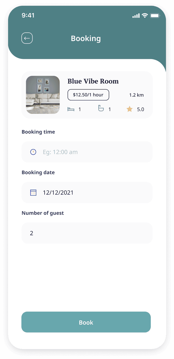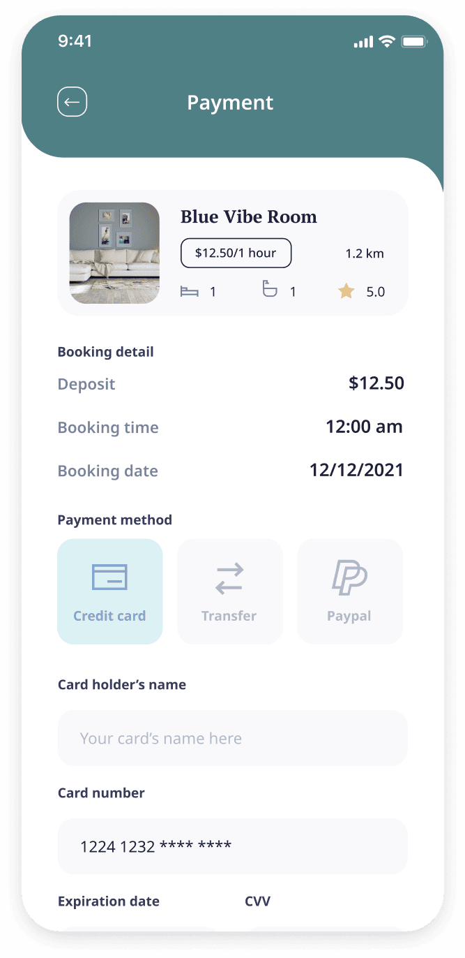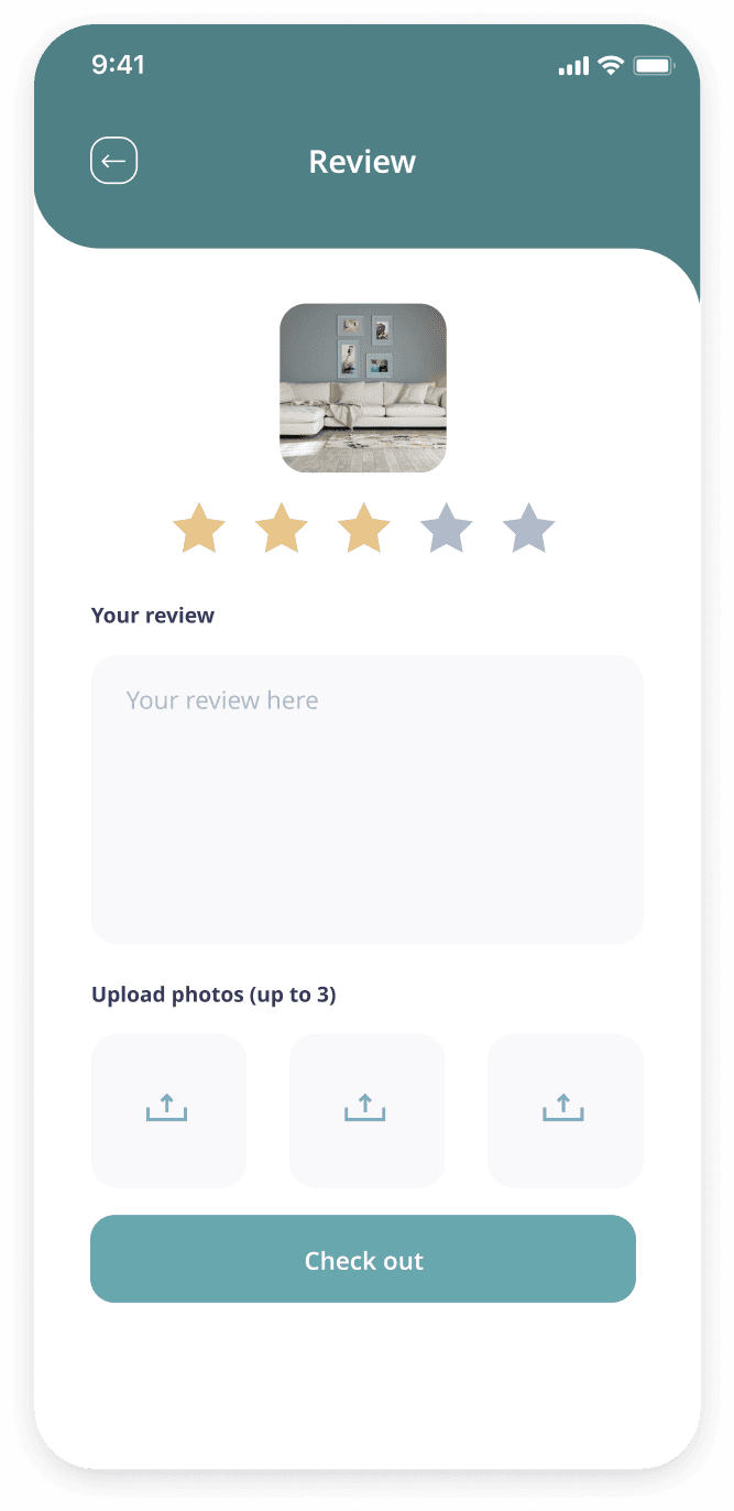
We started our design process by conducting a thorough analysis of the client's vision and desired functionalities for the app. Additionally, we delved deep into competitor research to identify existing market solutions and potential areas for differentiation. This phase also encompassed a rigorous audience analysis, allowing us to tailor the user interface and functionalities to resonate with the target audience.

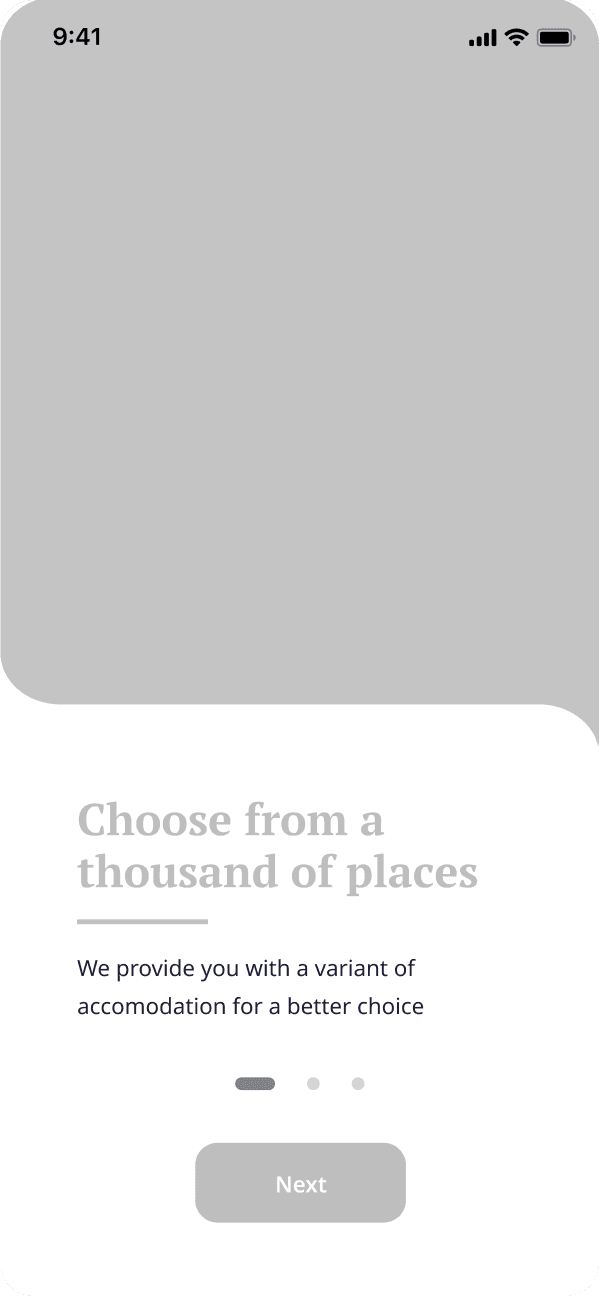
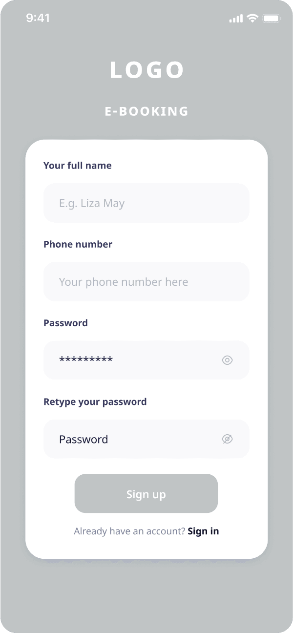
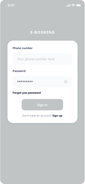
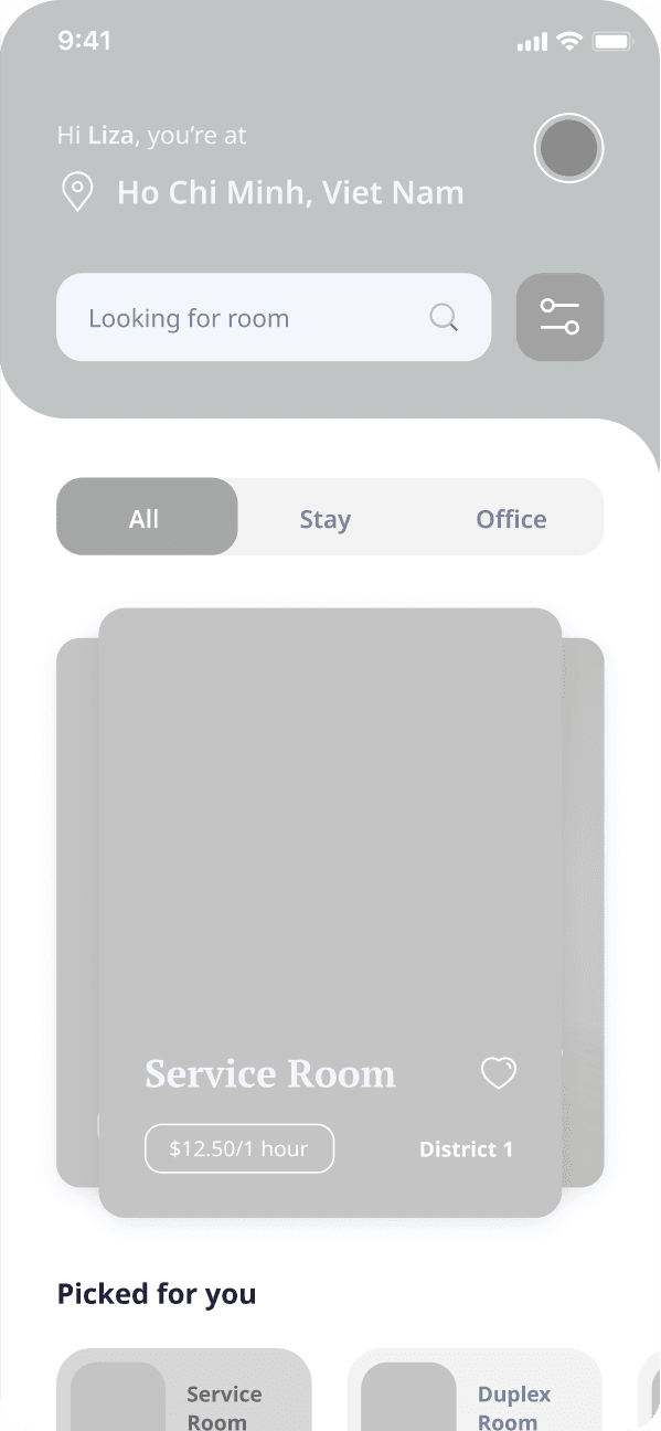
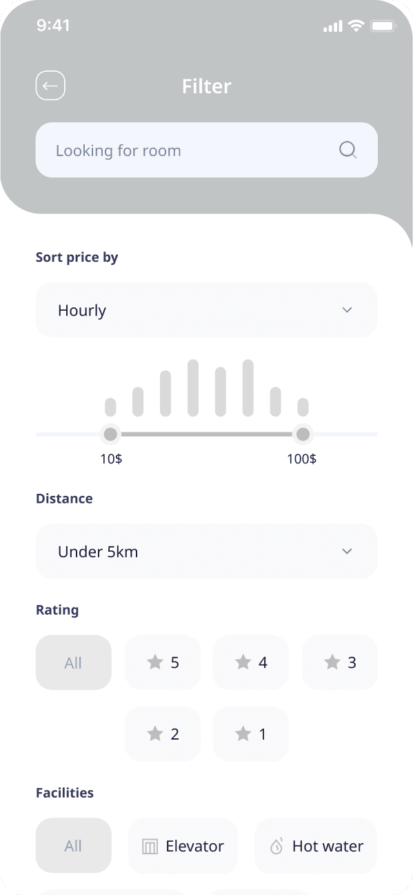
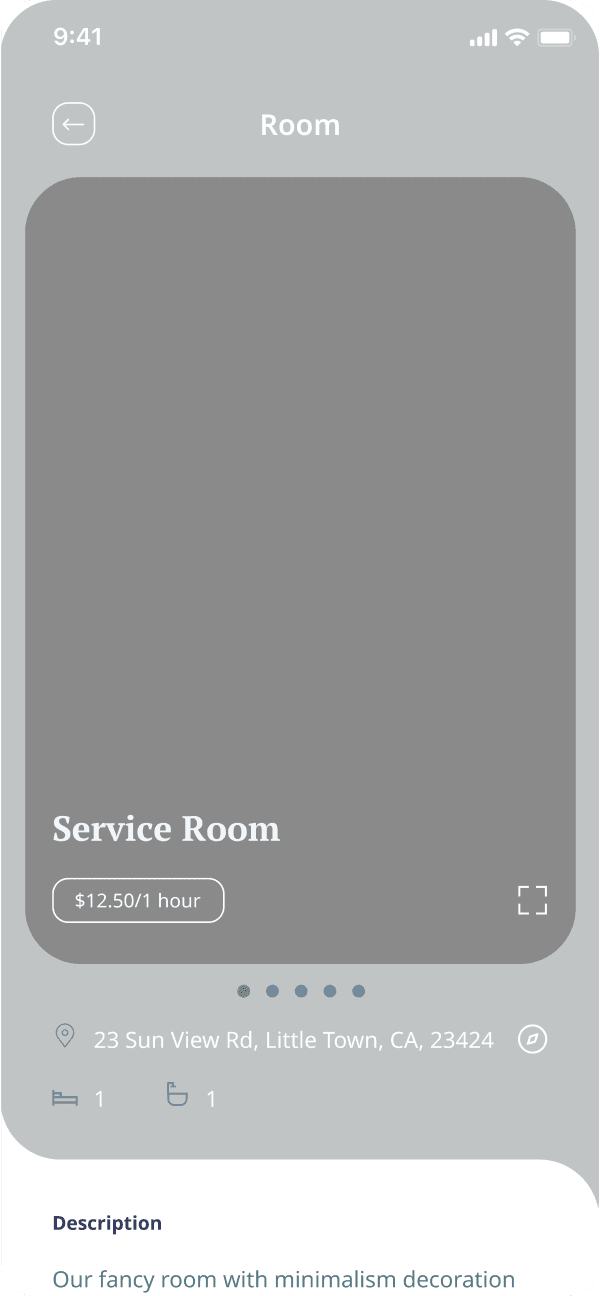
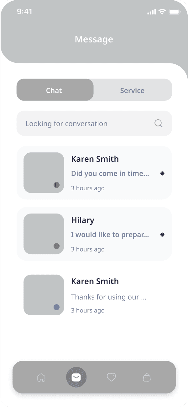
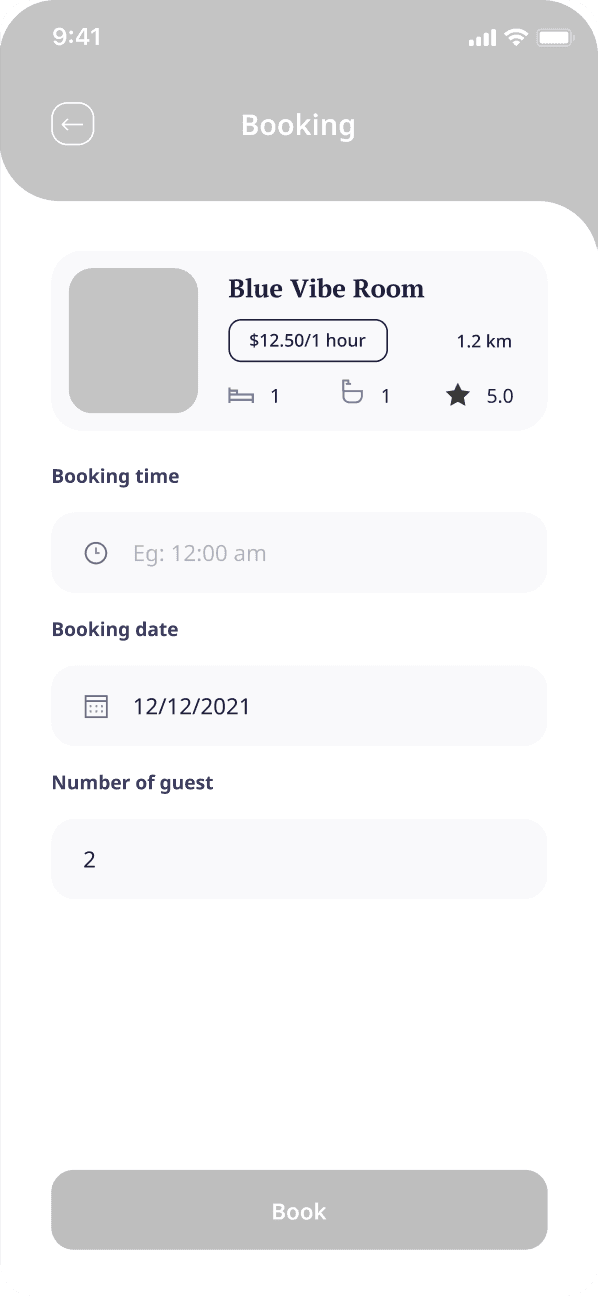
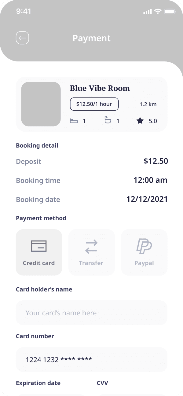
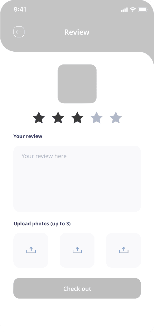
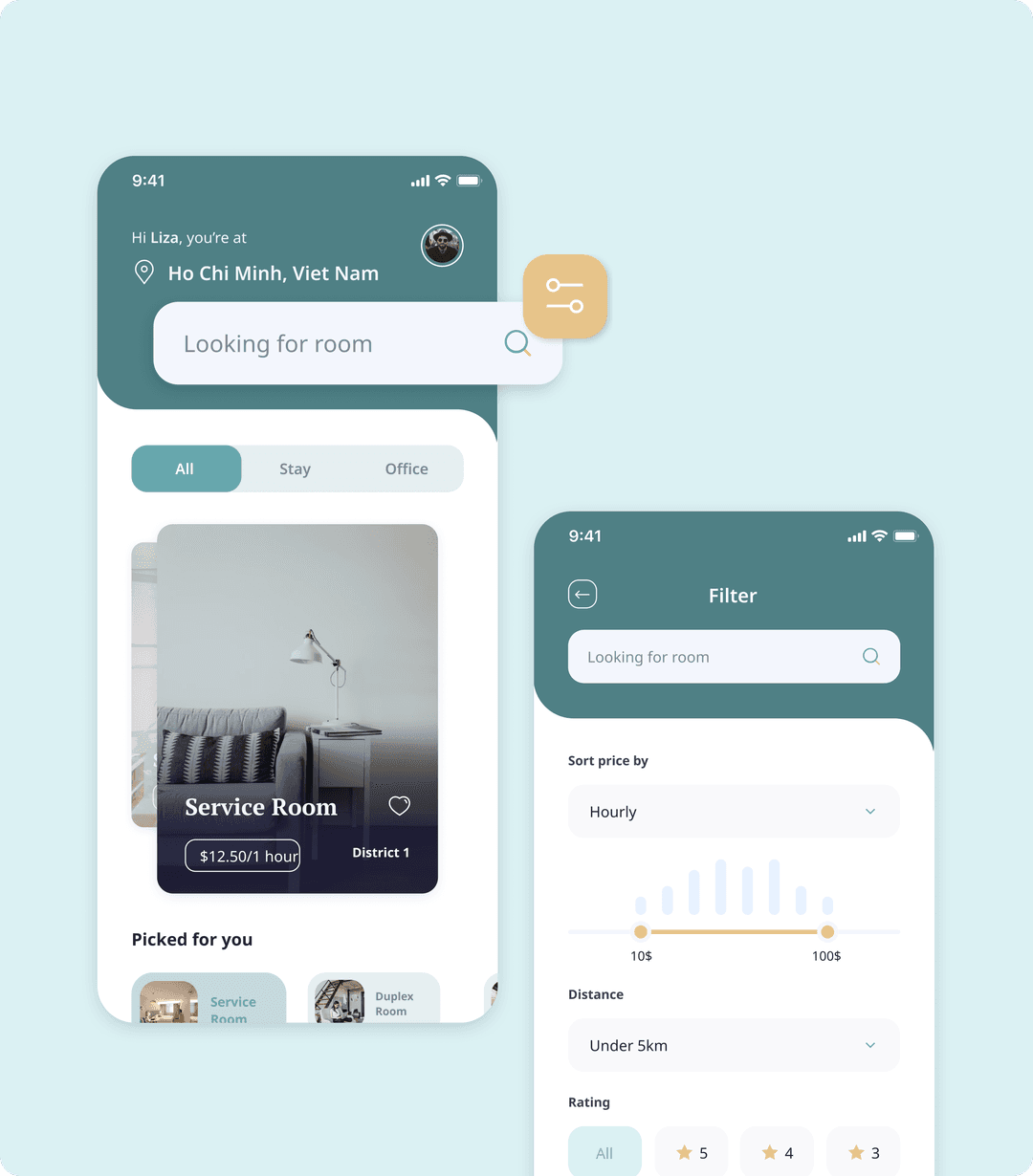
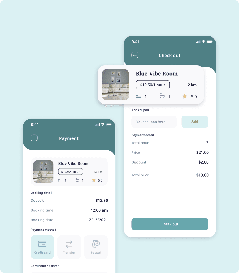
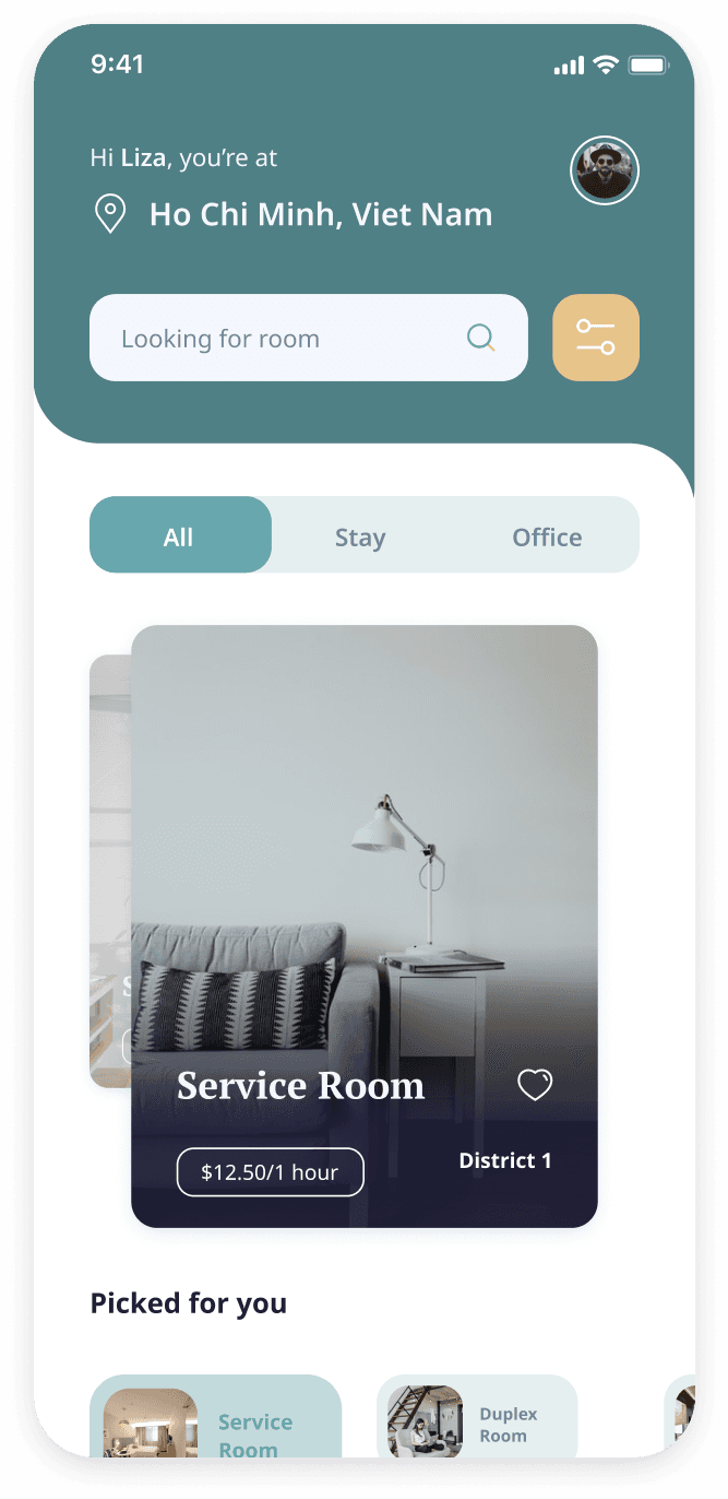
Armed with the insights gleaned from the research and discovery phase, we transitioned into the wireframing stage. Here, we meticulously crafted wireframes that served as a visual blueprint for the app's architecture and user flow. These wireframes provided a foundation for structuring the app's functionalities, such as search filters, listing details, and secure booking processes, all tailored to the specific needs of the booking industry.

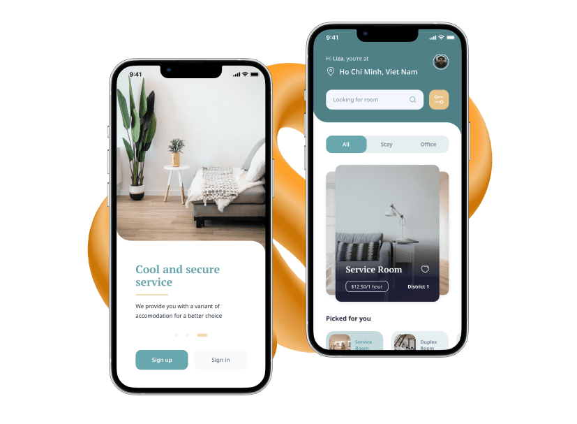
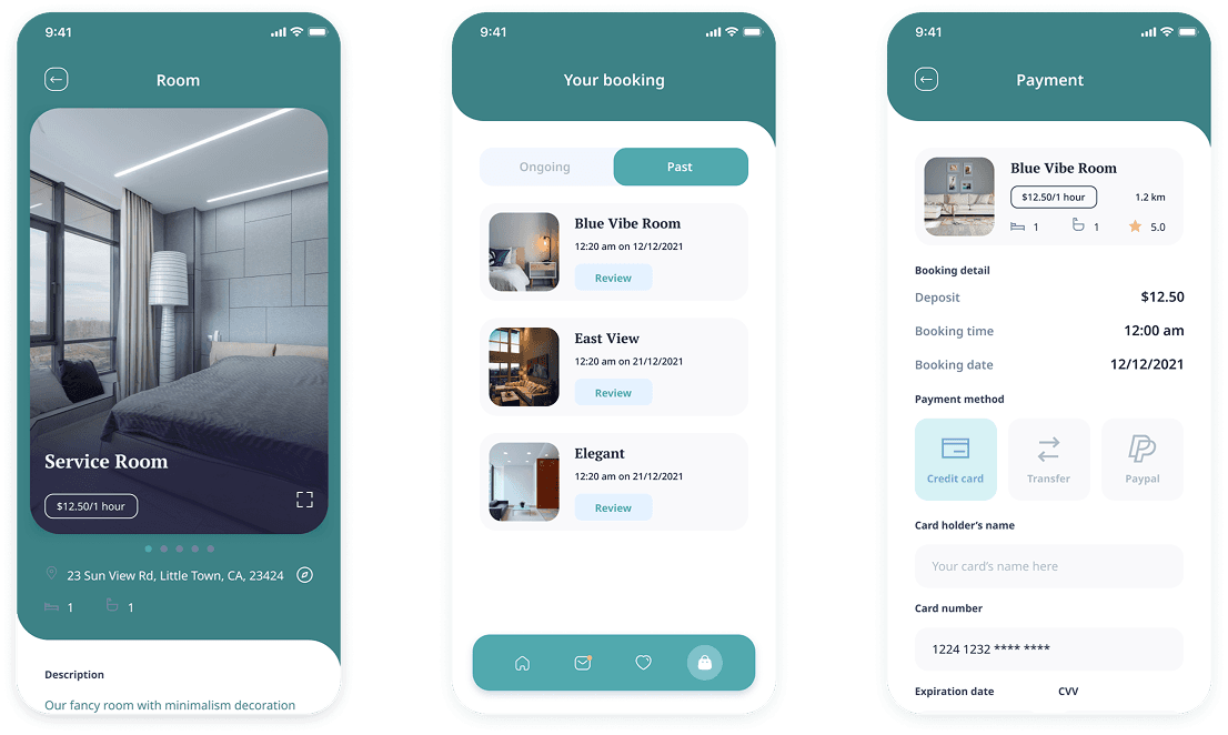
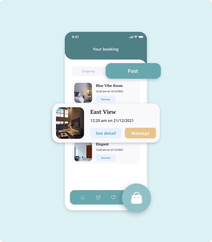
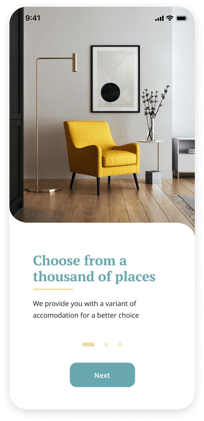
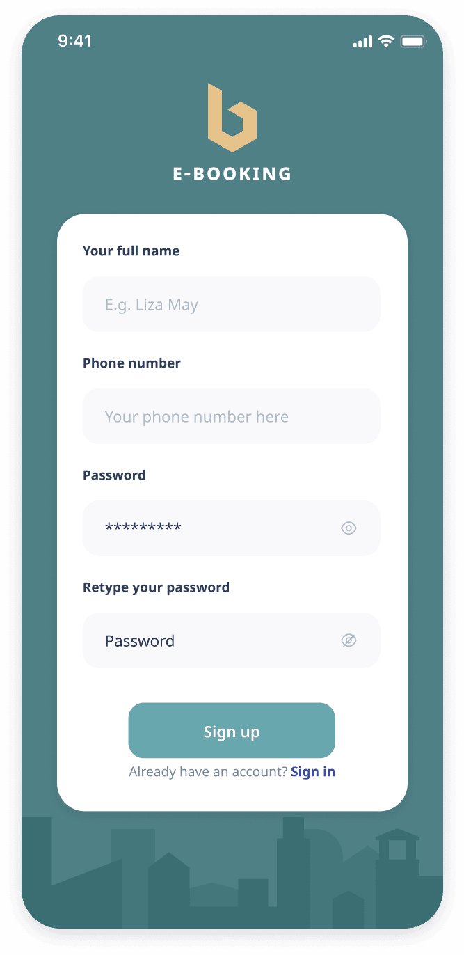
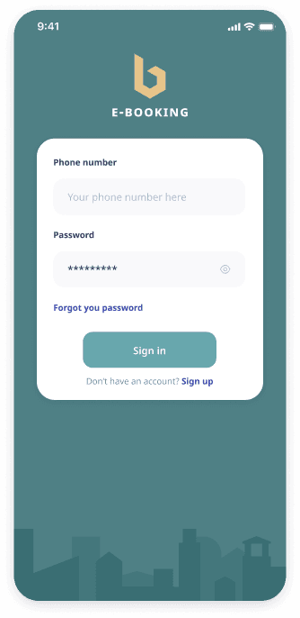
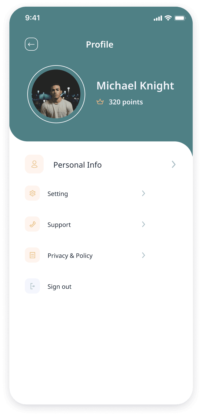
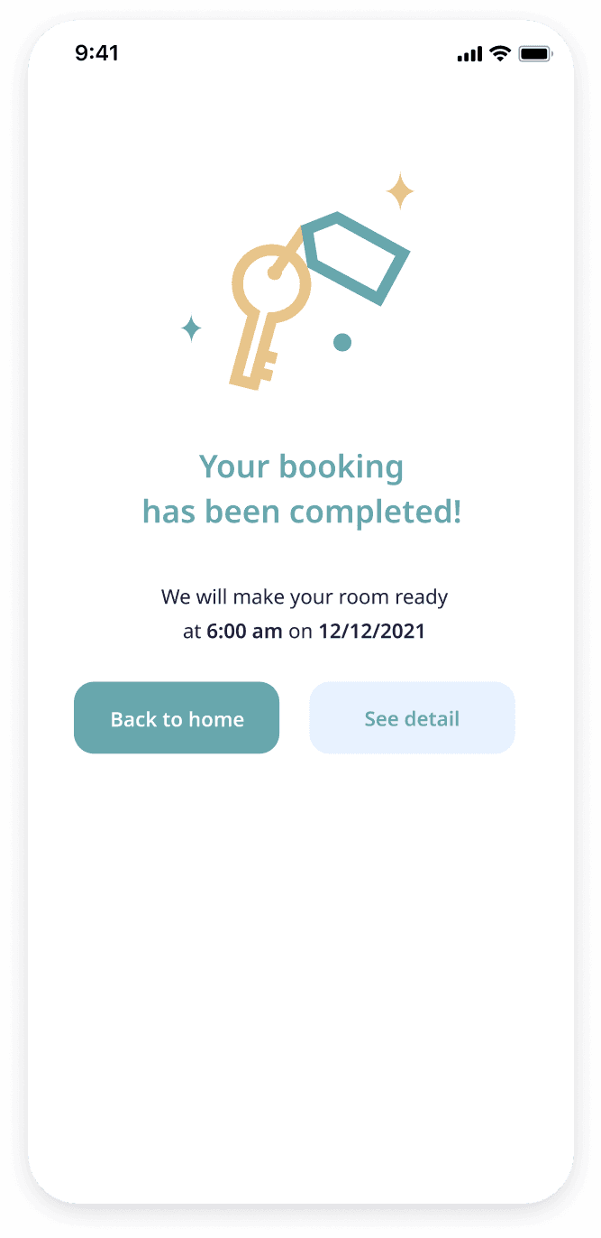
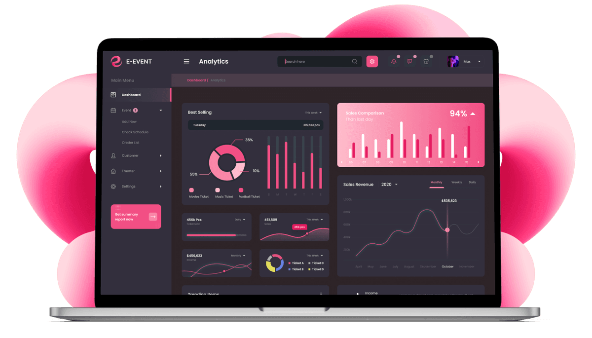
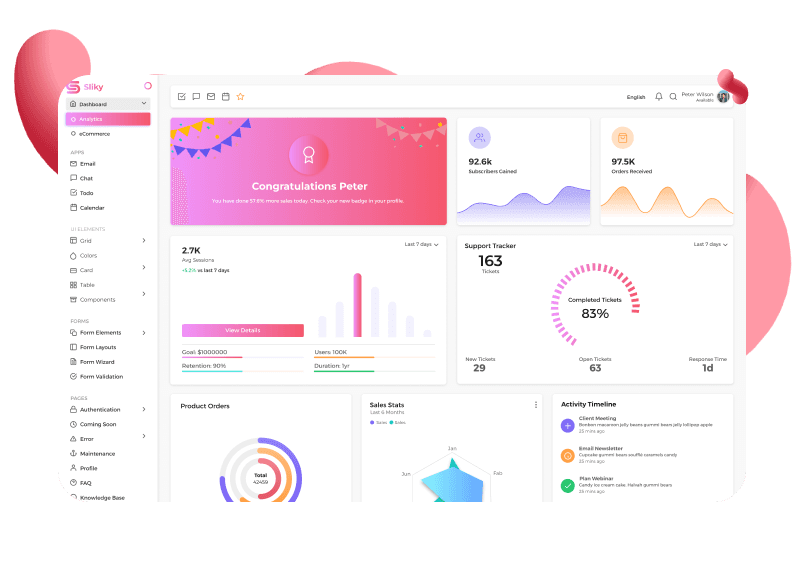
Following the establishment of the core user flows, we transitioned to the UI design phase. Here, we translated wireframes into user-friendly, visually appealing interfaces. This phase involved the selection of visual elements, color palettes, and typography that aligned with the target audience and facilitated intuitive navigation.

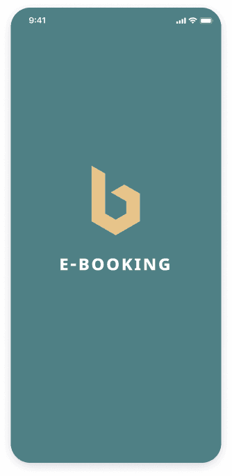
In addition to the app's UX/UI design, we developed a distinct logo that complemented the overall user experience. The logo, featuring the letter "b," serves as a visual identifier for the brand and reinforces the core function of the application – booking apartments.

The final stage of our design process involved the creation of a clickable prototype. This interactive model provided a realistic representation of the app's functionalities, allowing the client to experience the user flow firsthand. This facilitated valuable feedback and enabled us to refine the design based on the client's insights before transitioning to the development phase.

