We started the project with a comprehensive research and discovery phase. Our design team engaged in in-depth discussions with the client to fully understand his vision and desired functionalities for the app. Parallel to this, we conducted thorough competitor research and user analysis to gain valuable insights into current market trends and target audience needs. This initial phase equipped us with a deep understanding of the client's goals and the user landscape, forming a solid foundation for the design process.

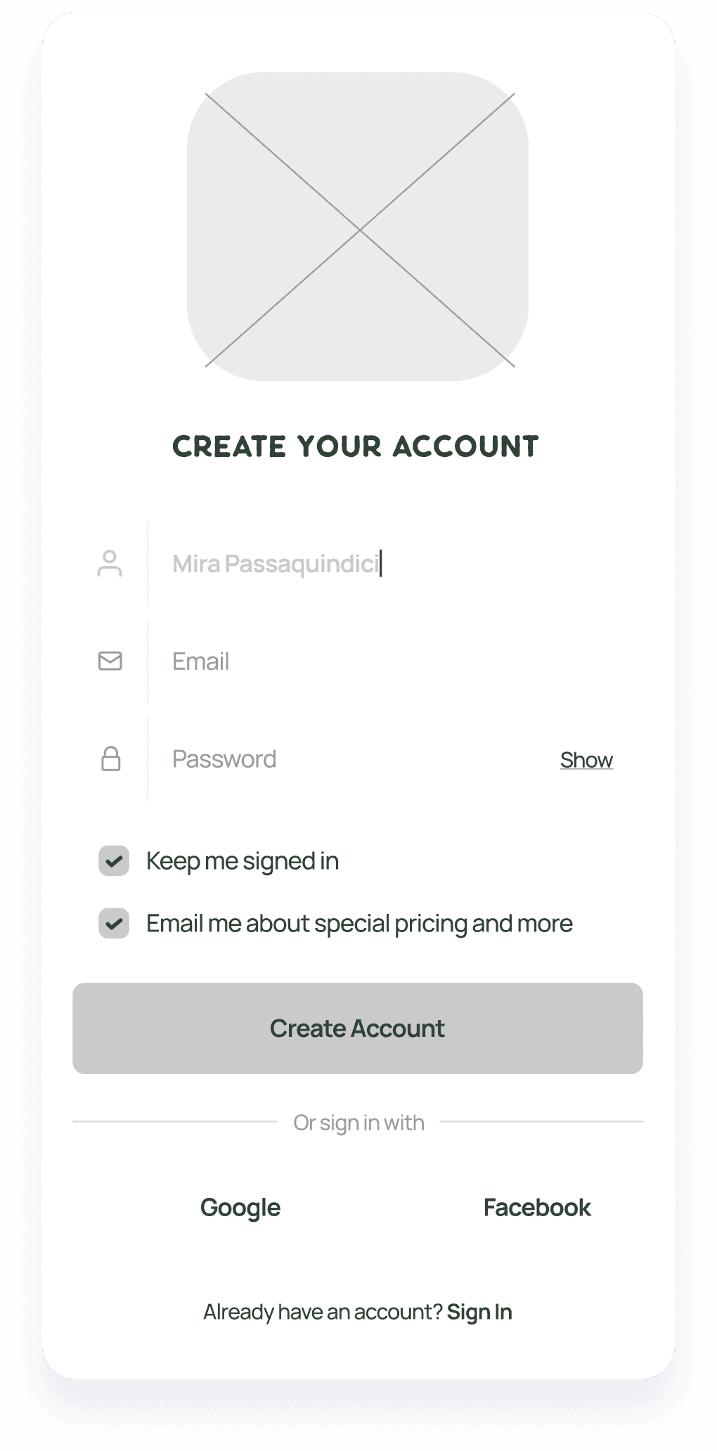
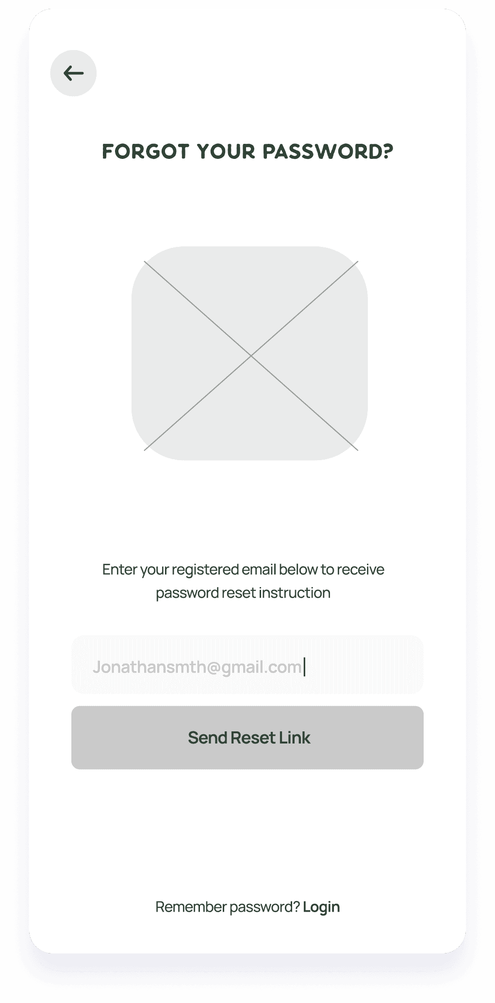
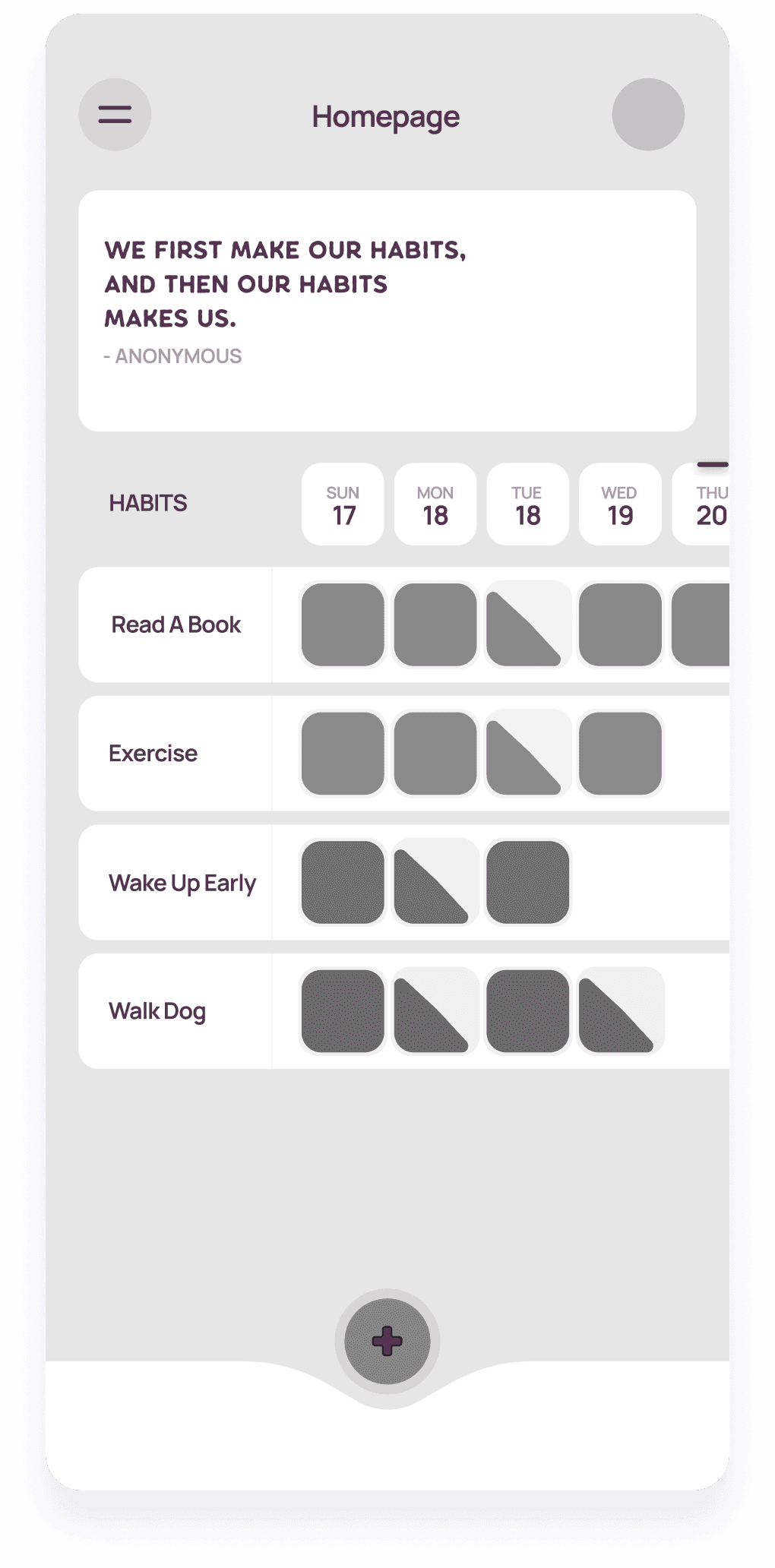
Following the research and discovery phase, we transitioned to the wireframing stage. Here, our focus shifted towards crafting a user-friendly and intuitive information architecture for the app. Through the creation of wireframes, we explored various design layouts and functionalities, prioritizing a workflow that would optimize the habit tracking experience. This iterative process enabled us to refine the core structure of the app, ensuring a seamless and efficient user journey.

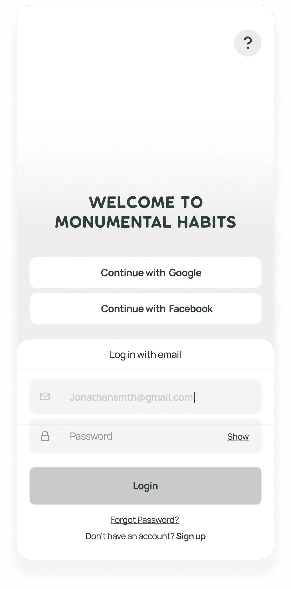
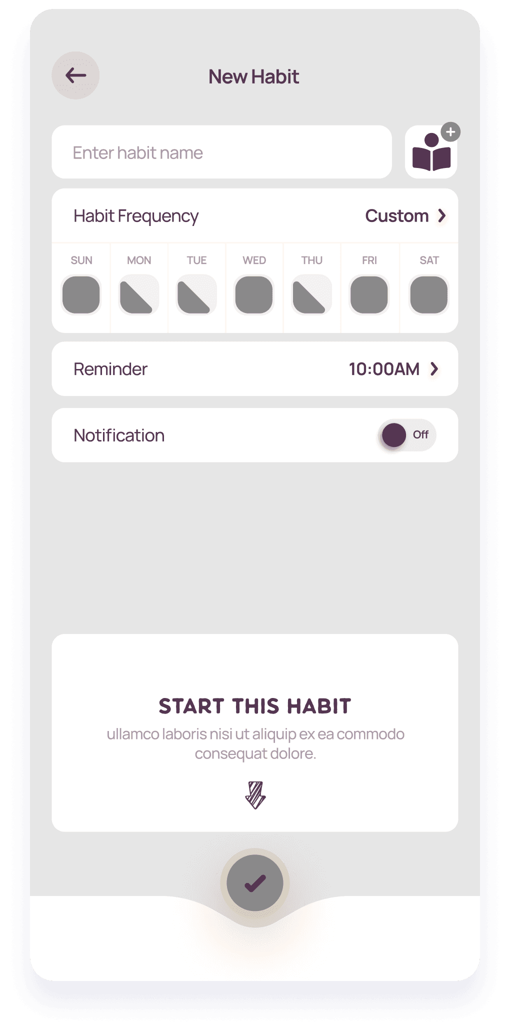
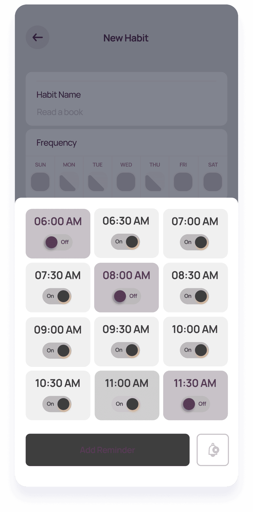
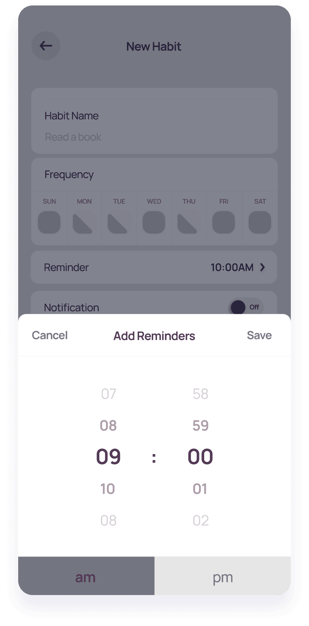
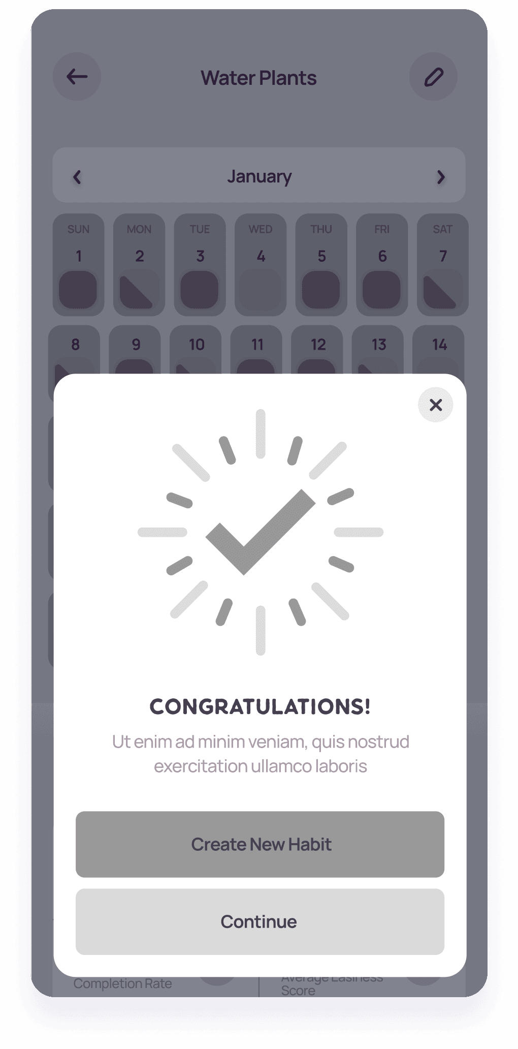
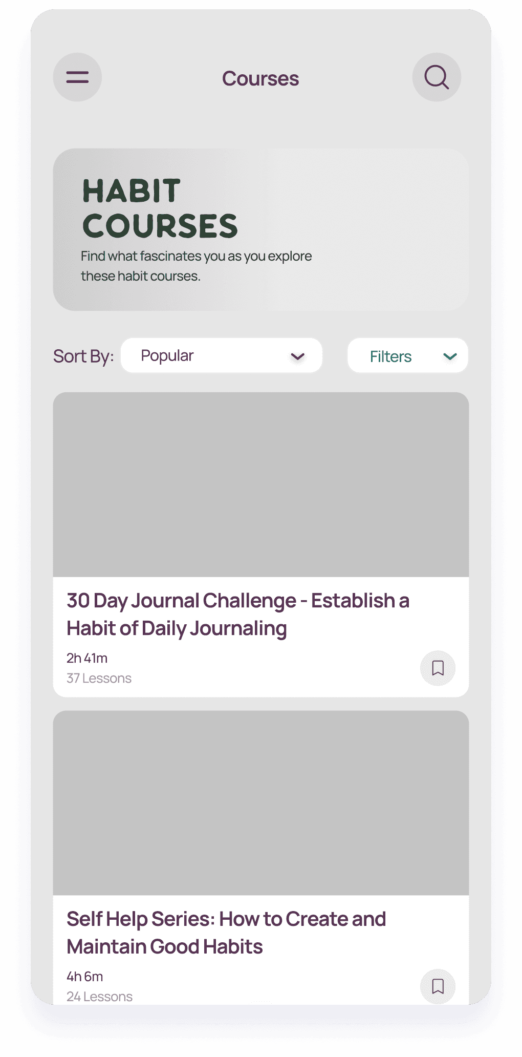
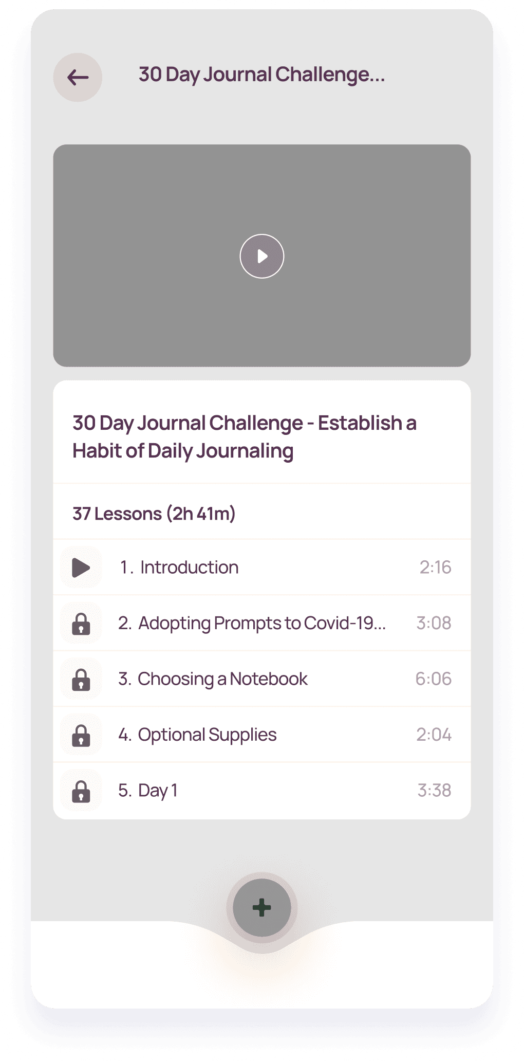
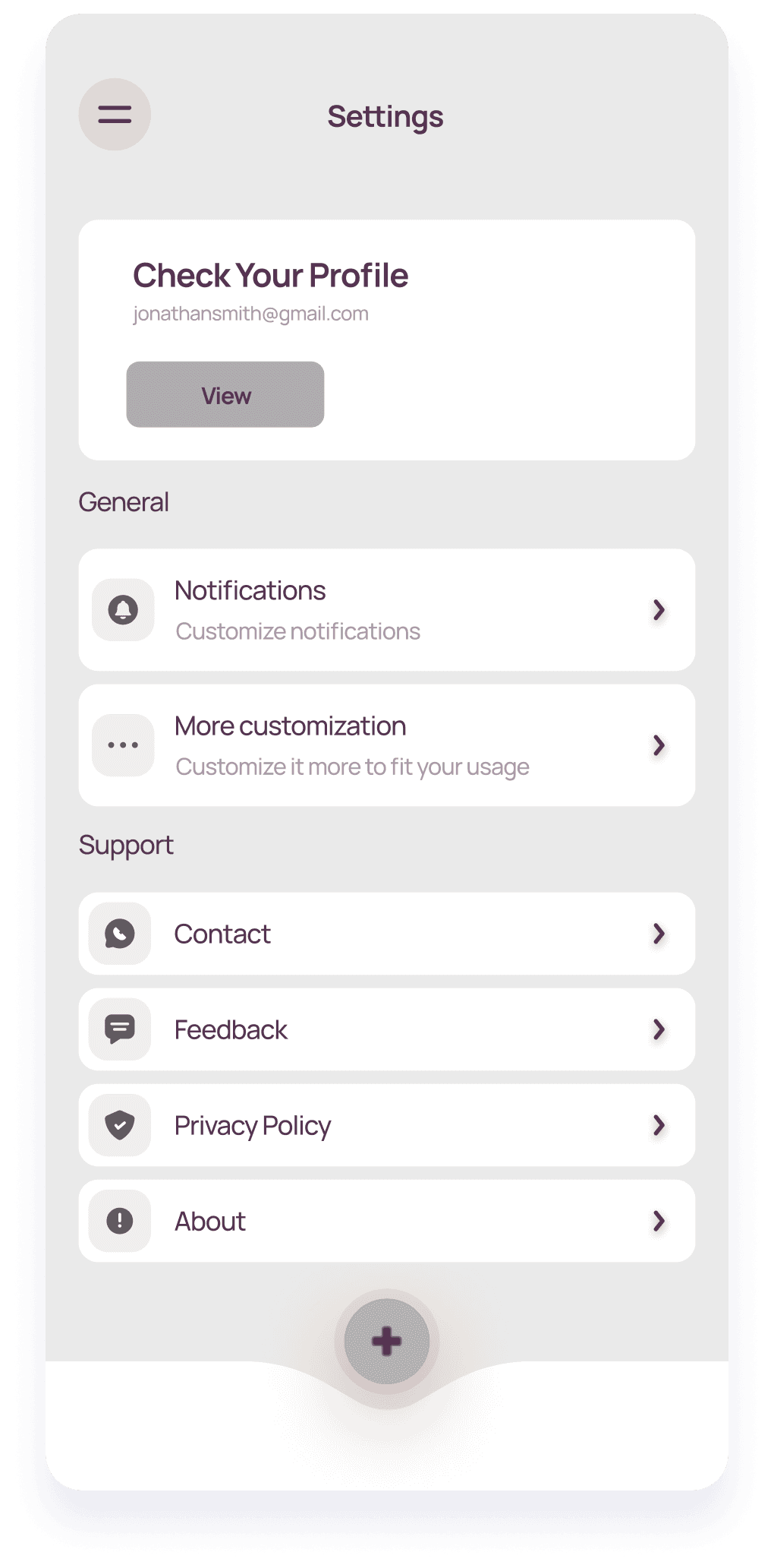
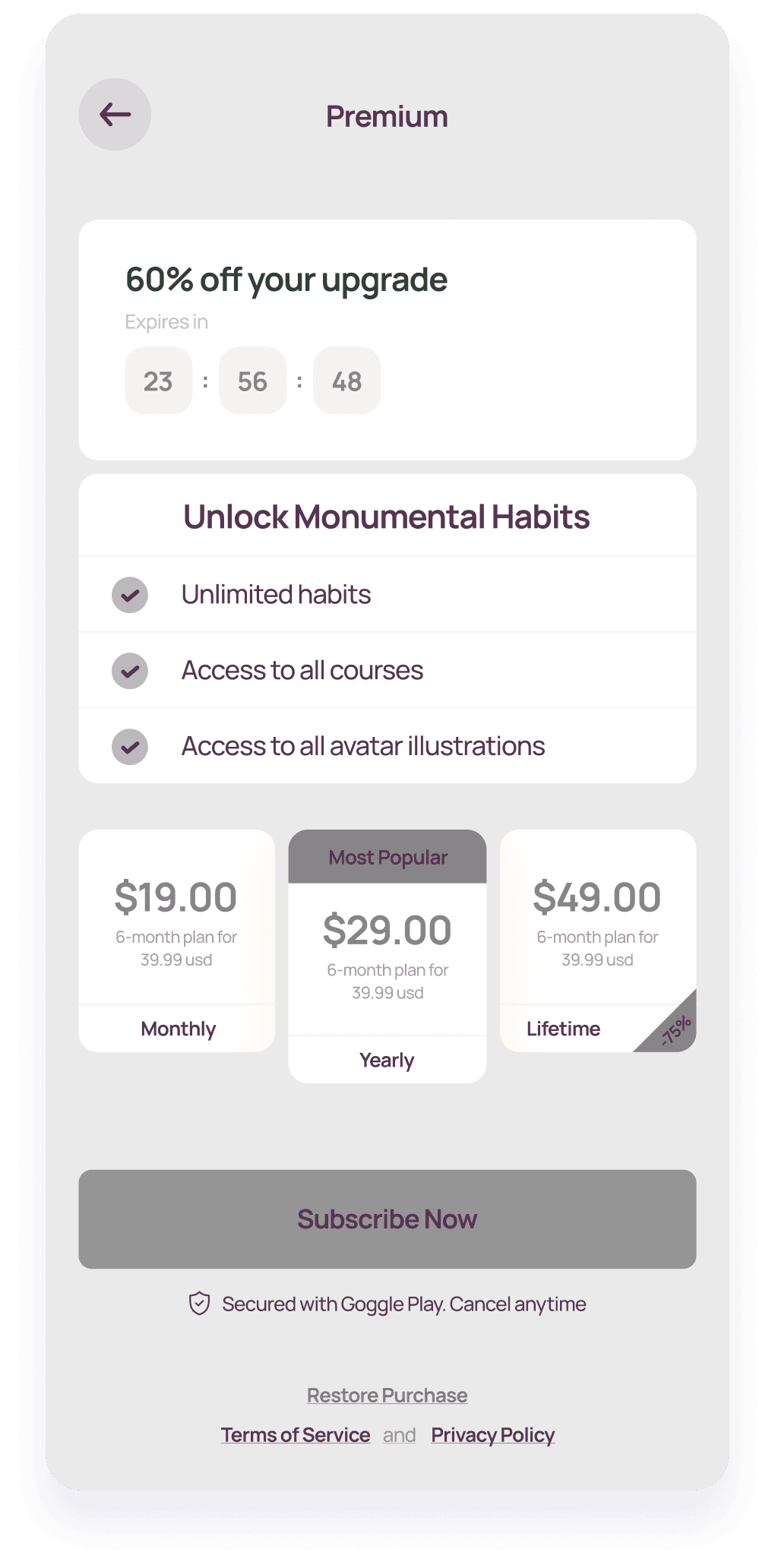
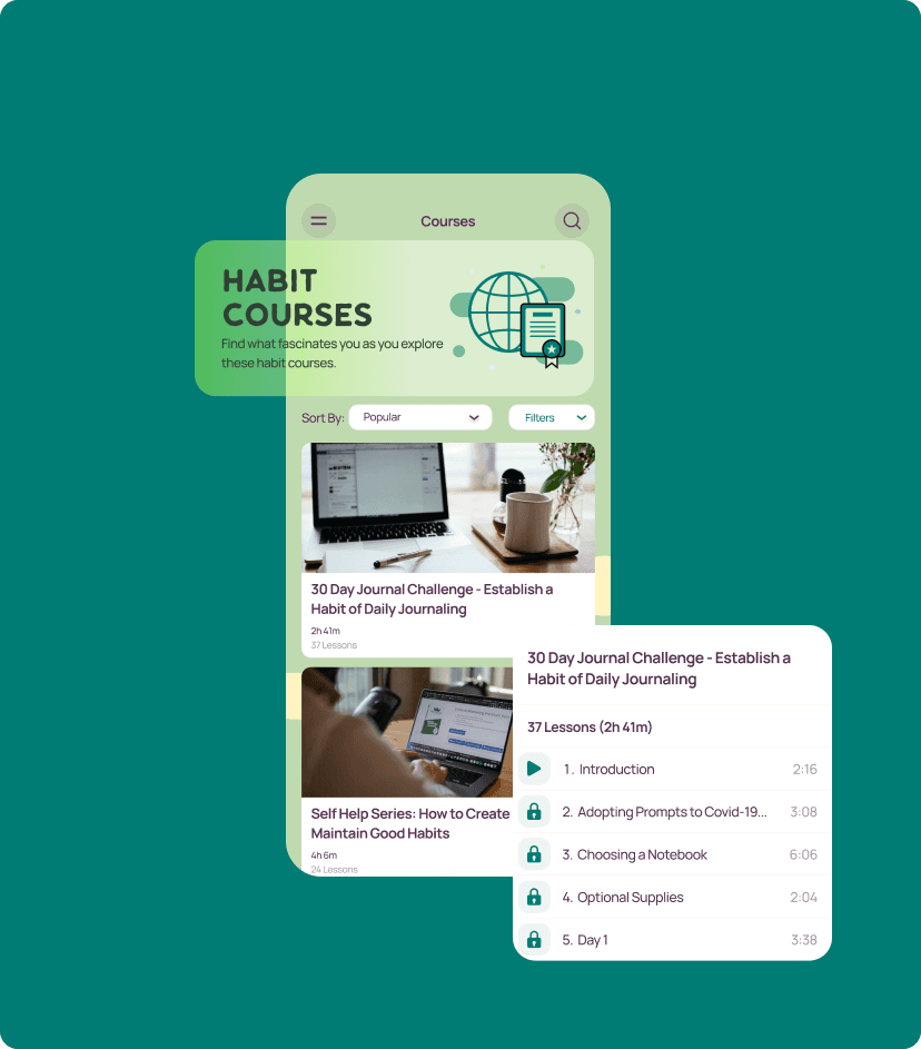
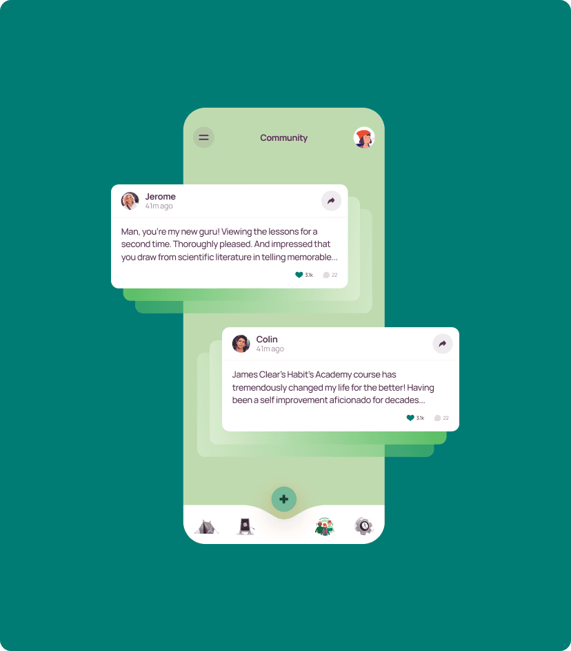
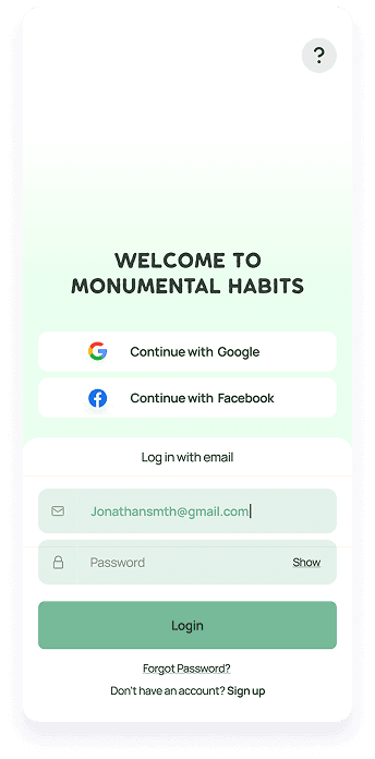
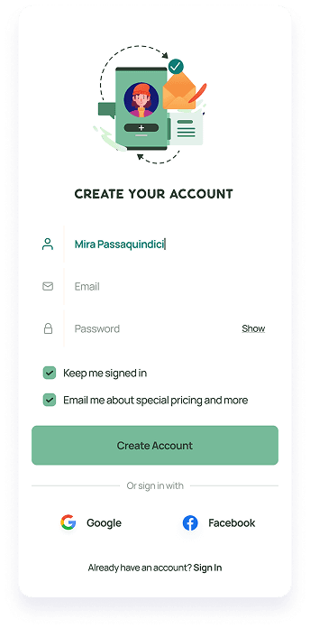
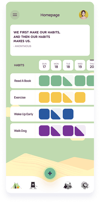
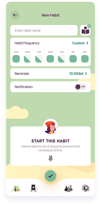
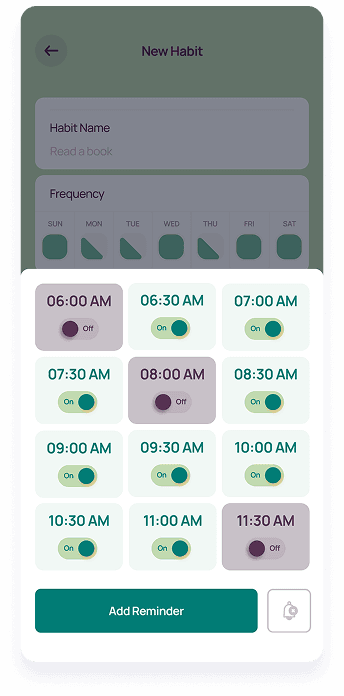
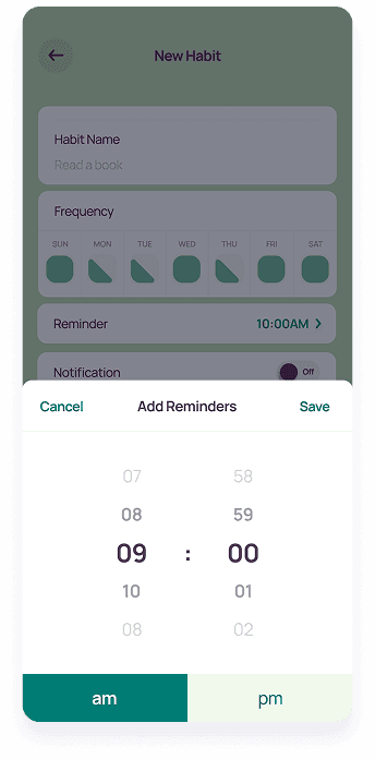
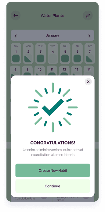
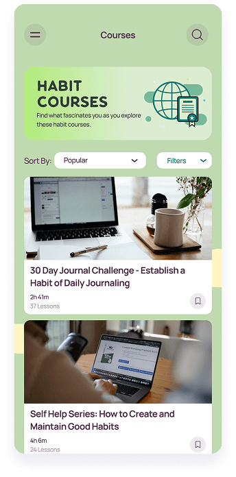
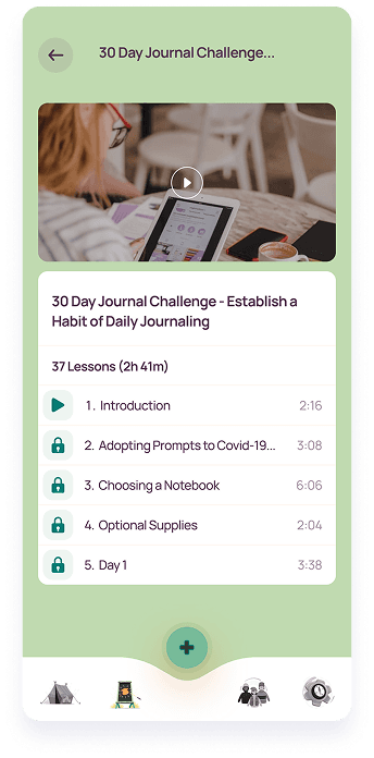
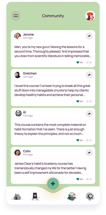
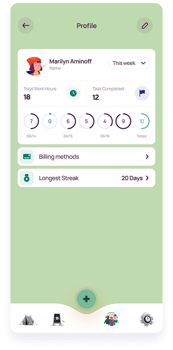
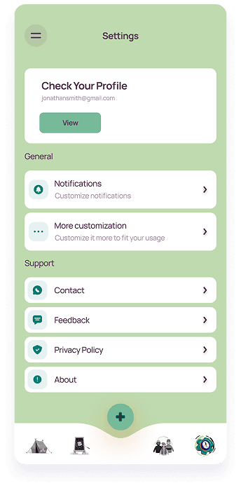
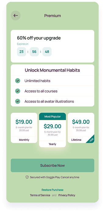
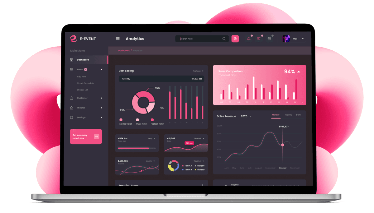
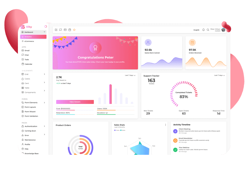
With the foundation established through wireframing, we moved forward with the UI design phase. In this stage, our focus transitioned from layout to aesthetics, translating the UX concepts into UI. Drawing inspiration from the client's vision and target audience, we developed a design language that prioritized clarity, functionality, and user engagement. This phase involved crafting visual elements such as icons, color palettes and more, all working cohesively to create user-centric and visually compelling interfaces.

A crucial aspect of our design process involved crafting a logo that effectively communicated the core message of LifeBalance. We designed a logo featuring a mountain silhouette, symbolizing the concept of personal growth and overcoming challenges. This visual representation aligns perfectly with the app's purpose of empowering users to develop positive habits and ascend to a better version of themselves.

The final stage of our design process involved the development of a clickable prototype. This interactive prototype allowed the client to experience the app firsthand and provide valuable feedback on UX/UI. By incorporating the client's feedback, we were able to refine the design and ensure a seamless and intuitive user experience before development started.


