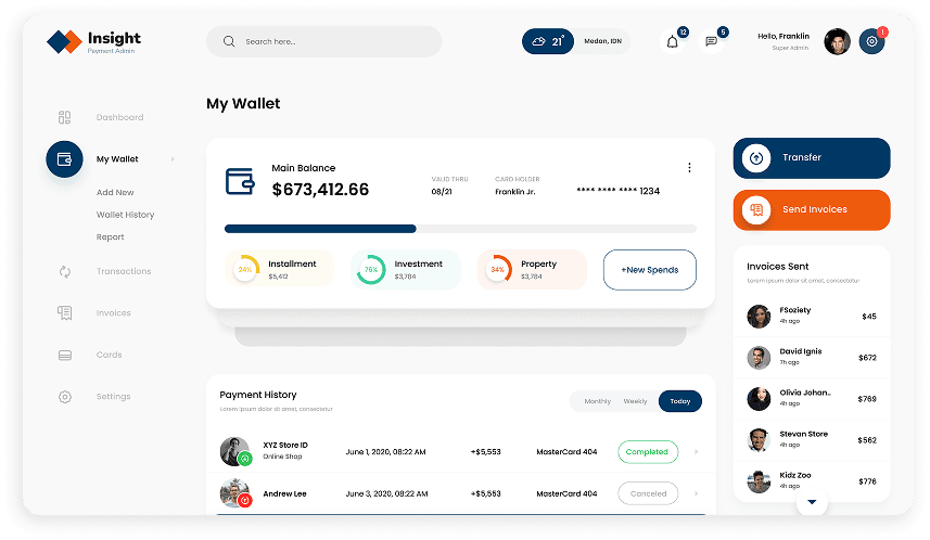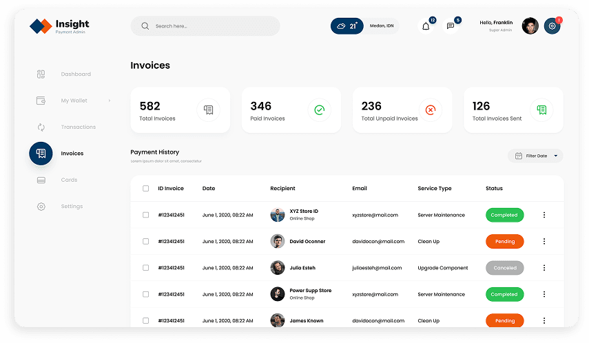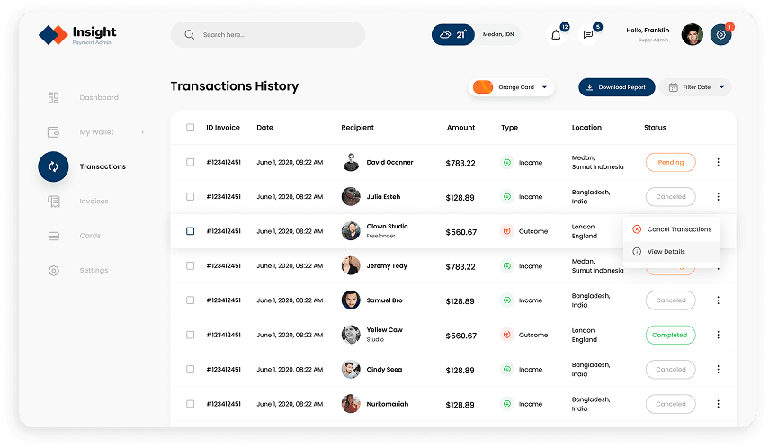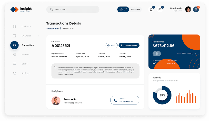
Our design process started with a comprehensive research and discovery phase. We delved into the client's vision for the payment admin panel, thoroughly examined the client's specific requirements, and conducted a meticulous analysis of competitor offerings. Additionally, we performed in-depth user research to gain a clear understanding of the target audience's needs and pain points within the payment management workflow.

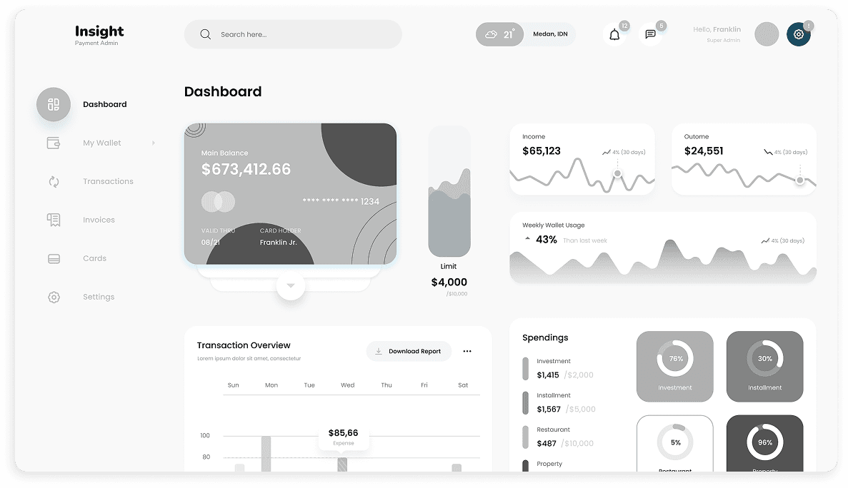
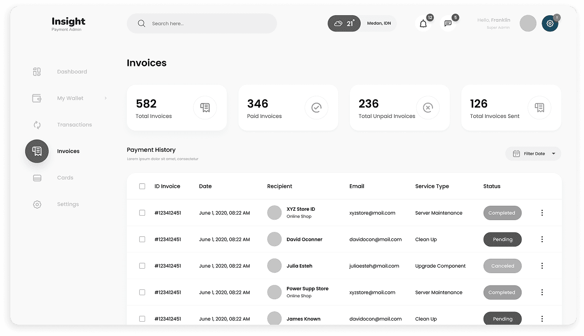
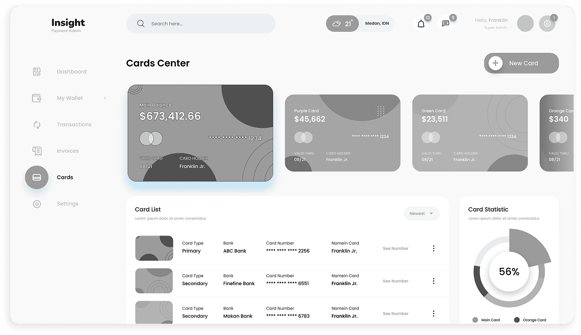
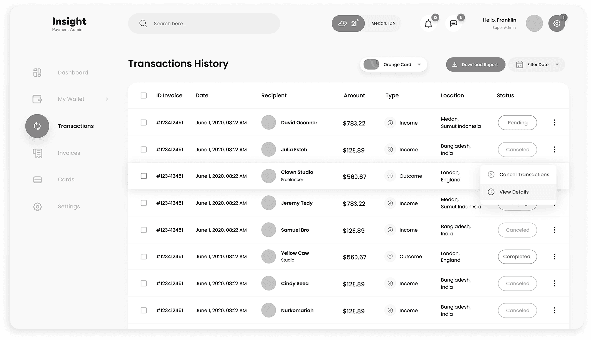
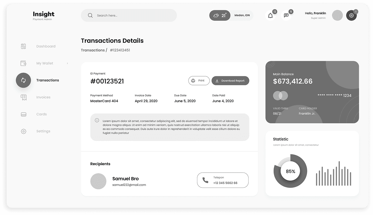
Leveraging the insights gleaned from the research and discovery phase, we crafted wireframes. These wireframes served as a blueprint, outlining the core functionalities and user flows for the payment admin panel. This stage prioritized establishing a clear information architecture and a user-centric journey for managing invoices, transactions, and financial data.

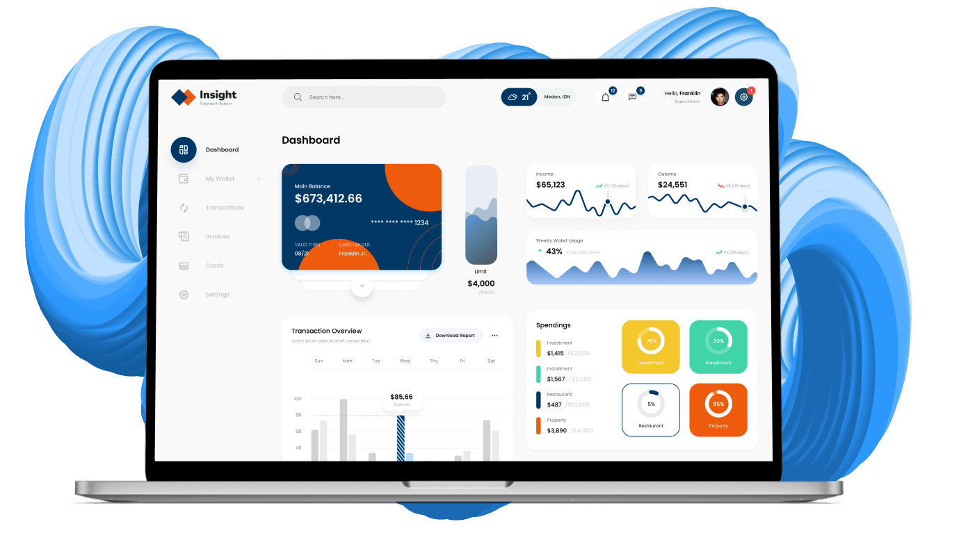
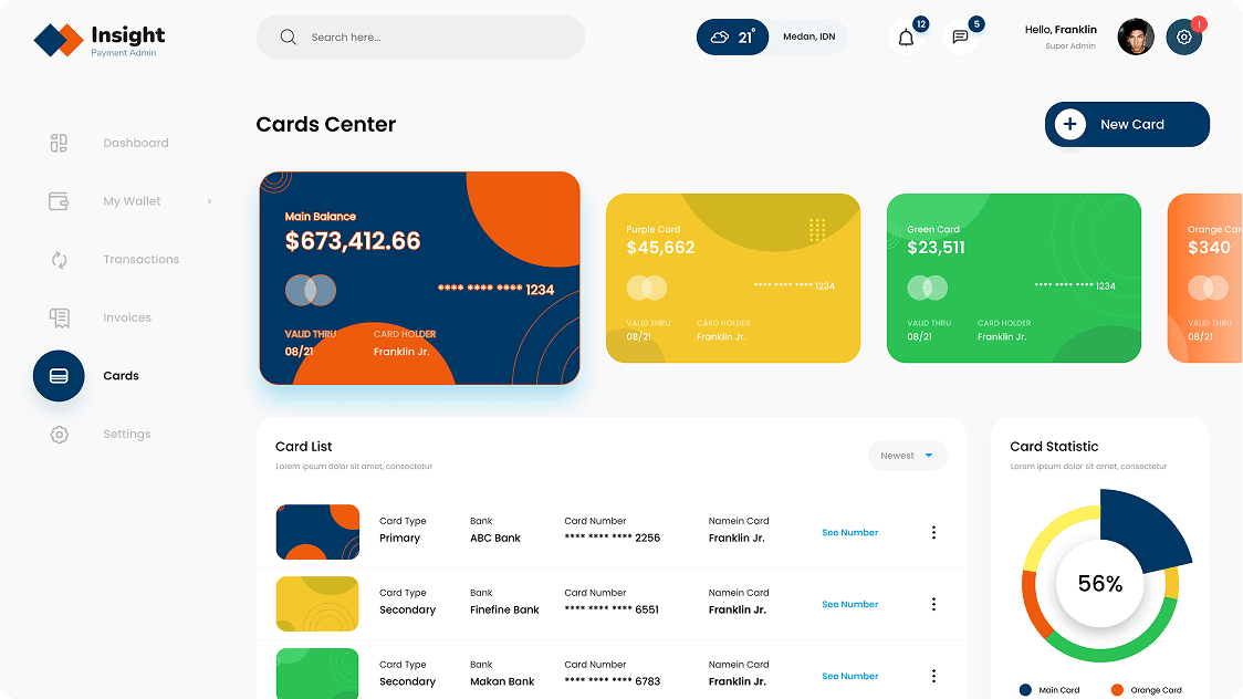
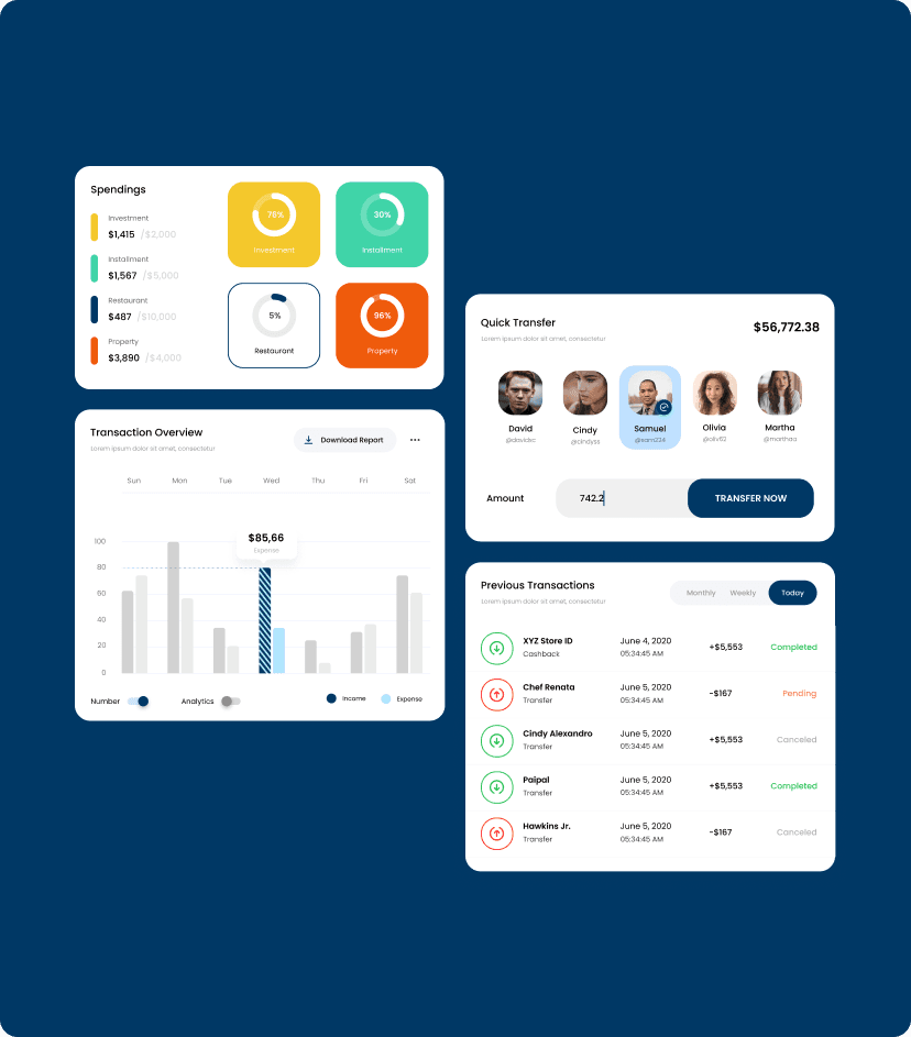
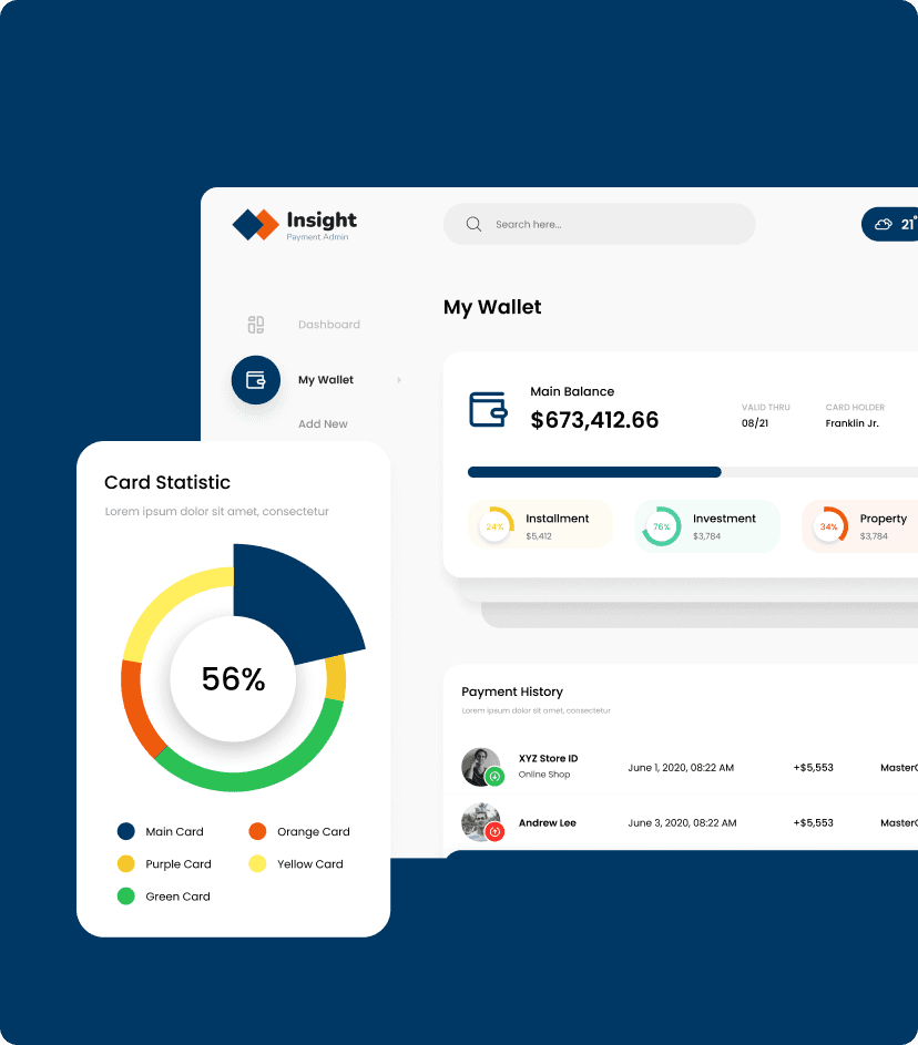
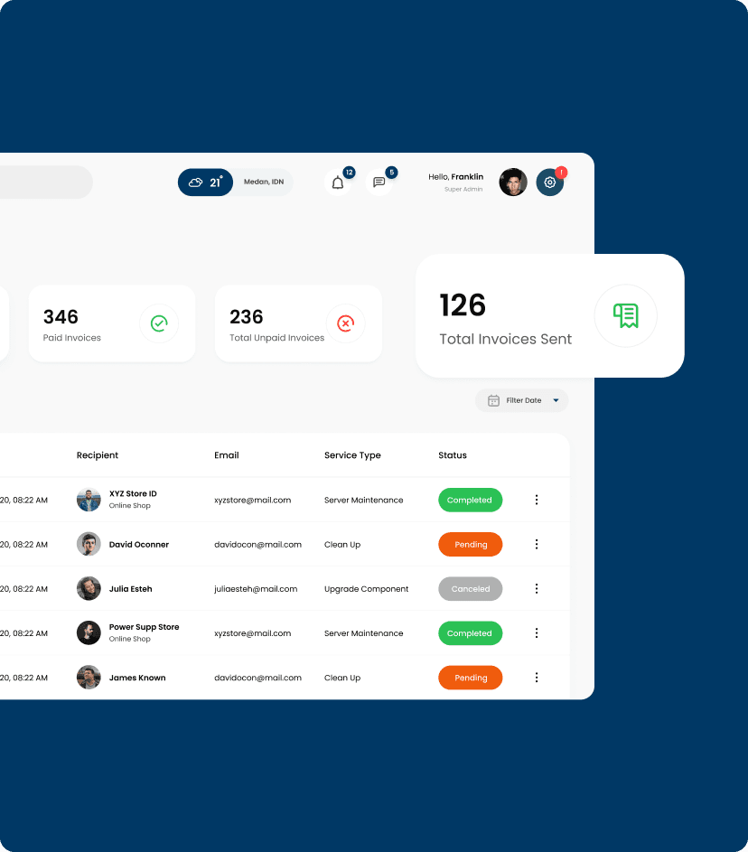
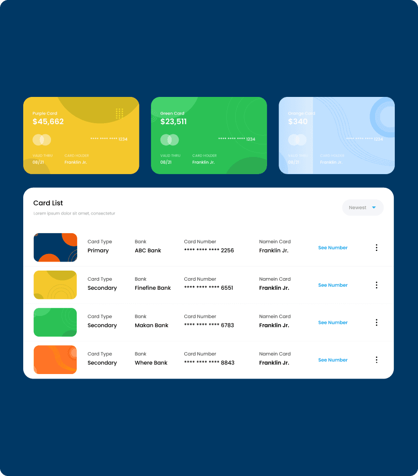
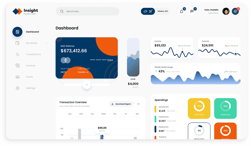
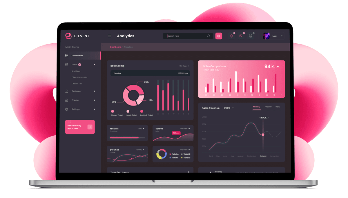
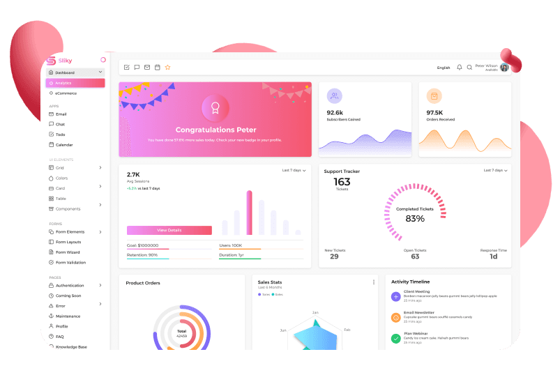
Following the established wireframes, we translated the UX into UI. Our focus shifted towards crafting user interfaces that were not only aesthetically pleasing but also clear, concise, and easy to navigate. We incorporated industry-standard design elements and data visualization principles to ensure users could readily understand and interact with financial information within the payment admin panel.

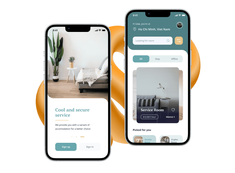
Recognizing the diverse usage patterns within the fintech industry, we implemented adaptive design principles. This ensured the payment admin panel seamlessly adapts to various screen sizes and devices, be it desktops, tablets, or mobile phones. This adaptability empowers payment admins with the flexibility to access and manage financial data from any location and device.

The culmination of our design process came in the form of a clickable prototype. This interactive model provided the client with a firsthand opportunity to experience the admin panel in action. The prototype allowed him to simulate real-world usage scenarios and provide valuable feedback. By incorporating this feedback, we were able to refine the user experience and ensure a truly exceptional payment management solution upon final delivery.

