To kickstart our design journey, we temporarily stepped into the shoes of realtors to get firsthand insights into what challenges they face in their daily work. We interviewed agents and brokers to identify the pressing moments in their workflow. Then, we studied user behavior to learn how individuals search for property offers. The findings guided us in creating a responsive design platform with core features for the real estate industry and fully meeting the expectations of both the client and its customers.

Next, we translated these insights into basic layouts or wireframes. This stage helped us map out Deely's core functionalities and information architecture. Digital mockups demonstrated CRM’s layout, screen organization, and placement of essential elements. Multiple iterations allowed us to recreate the most optimal user experience and arrange buttons, menus, forms, and information displays like broker contacts or property listings to achieve a clear and intuitive user flow. We could see potential usability issues and eliminate these before the core design stage.

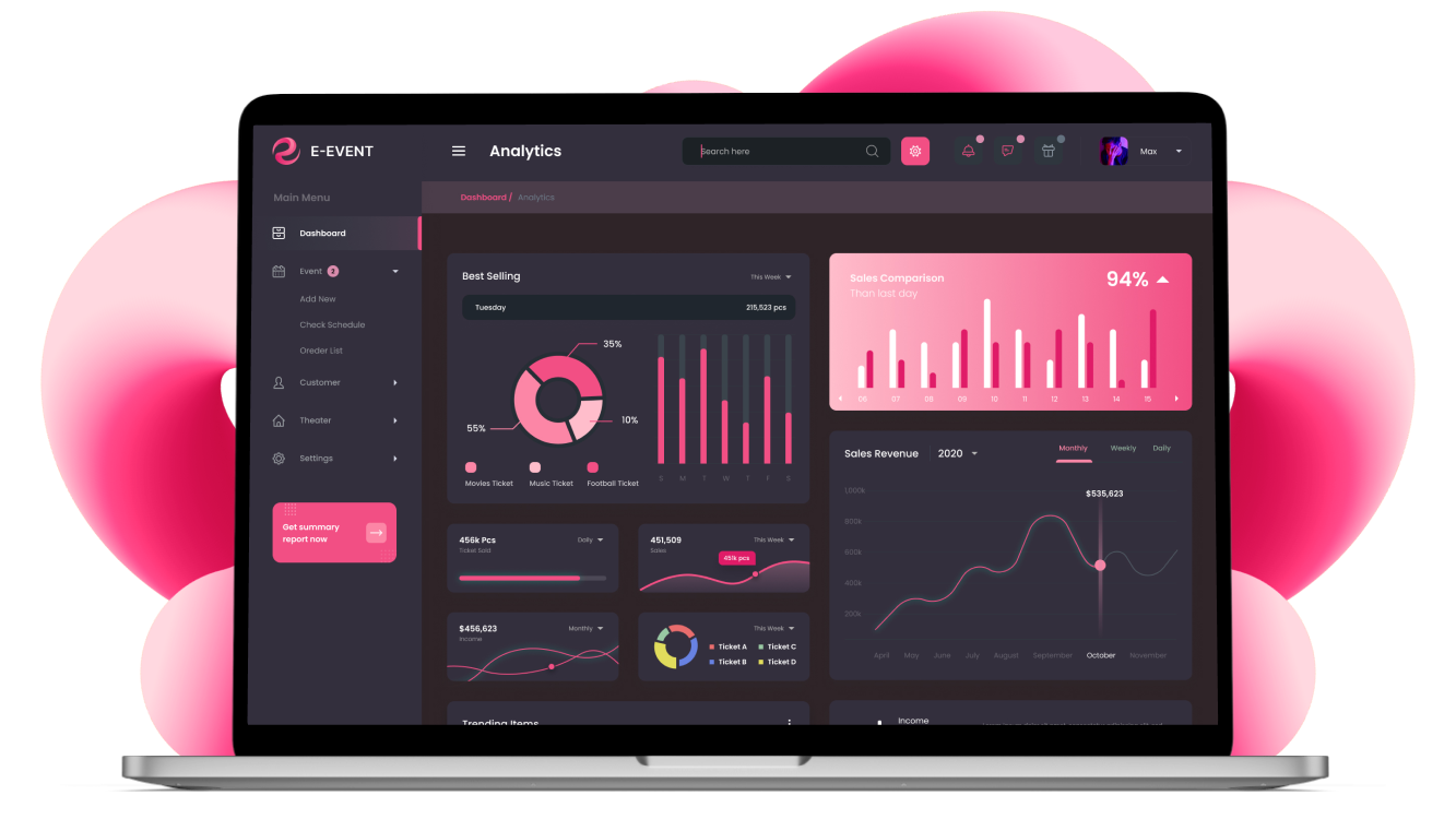
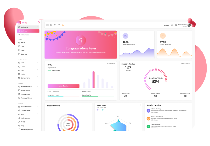
Having completed the backbone of the Deely CRM, we moved to the User Interface (UI) design. Our designers focused on the visual elements and overall look and feel of the product. It is all about making functionality intuitive and aesthetically pleasing. First, UI is easy-to-use buttons and menus that simplify the CRM navigation. Besides, it has well-organized forms and data entry fields that automate property deals. A realtor can instantly access clients, deal history and property database, while users can easily browse listings and get additional information.

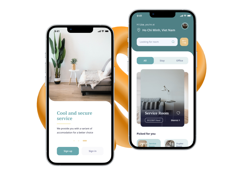
Real estate professionals are always on the go! We followed adaptive design principles so that the platform can flawlessly function on any screen size, from desktops to tablets and smartphones. Fluid grid systems and touch-friendly interactions were our priorities. Adaptive design makes Deely available to a wider user base and allows realtors to manage property deals effectively from anywhere. With Deely, a property video tour can be handled even with just a smartphone!

The primary purpose of a clickable prototype is to test how users navigate through the CRM. It is only a simulation of basic functionalities. Still, it enabled us to assess Deely's usability and identify areas for improvement. We demonstrated to the client how users will search for property offers, how they get in touch with realtors, etc. At the same time, the client could see how the platform simplifies the realtor routine – basic operations are automated and all key information is neatly arranged and always at hand. Feedback from the clickable prototype stage was used to boost the final CRM user experience.


