
Login pages are a significant part of onboarding on a mobile app or website. They serve as interaction starters and play a crucial role in shaping a positive user experience. Login page design can directly influence how people perceive your service or product. If it is an appealing and well-thought-out login form, users are more likely to continue exploring your website. Otherwise, they abandon the platform and pick another user-friendly service.
Having worked with clients in 42 countries across the globe and completed more than a hundred design projects, we understand the intricacies of designing login pages. At DreamX, we know why login forms matter, efficient practices for login page design, and key parts of successful login pages, and we are willing to share this experience in this article. Here, you will find examples of login page designs and evolving design trends, so go on reading to uncover login form design insights that can boost your product!
Note: If you seek ready-to-use user entry patterns, go straight down to the bottom of the article and find there our free PDF guide full of applicable UX patterns and onboarding approaches.
People go through multiple authentications daily. The more user-friendly login forms are, the more chance users will continue coming back to the platforms. A creative login page design makes visitors feel the website or app is treating them with attention. Moreover, a well-designed login form streamlines access and fosters trust among users and products. It defines the tone for future interactions. That’s why you should consider a login page as a significant entry point to your application or website.
User authentication design plays a critical role in user engagement and how visitors feel about the platform. When facing friction during login, whether it's through difficult-to-remember password requirements or confusing error messages, the user's likelihood of returning or converting decreases. A polished login page UI can help you gain user confidence and higher user retention, leading to better conversion rates. As users log in every time they decide to visit your platform, it’s of high importance to make the login process understandable and convenient. It is an attainable task if you make an effort to create a functional and aesthetically pleasing login page UI/UX design.
While a poorly designed login form provokes frustration, abandonment, or even users abandoning the service altogether, so avoid overly complicated login processes that can result in high bounce rates.
Whether you will find a UX designer to make an appealing login form or decide to do it yourself, you should know the essentials of login page design. Awareness about it can help you stay actively involved in the design process and check if your authentication form design aligns with your brand goals. So, learn the key elements that make up successful login pages.

An intuitive and clean login page layout invites users to engage more with your product, ensuring a smooth user experience. Position buttons, any additional options, and input fields in a way that feels easy to follow and natural. A minimalist login design will help users navigate effortlessly and perceive the content on an application or website easily. Remember to place tips and error messages in strategic locations so that visitors quickly find them. Also, keep in mind that no one likes a cluttered page. So, ample spacing is a top priority.
With increasing internet traffic coming from mobile devices in mind, you should optimize your platform for smartphones. Mobile-friendly login page design helps you broaden your audience and even your client base. Ensure forms that scale appropriately, have easy-to-tap buttons, and have a responsive design. This way, you attract more users and decrease the chance of frustration. Plus, responsive web design for login pages makes your app or website competitive.
If you look at some popular products’ login pages examples, you may notice that they are mainly easy to go through. This is because these login pages involve minimal steps. So, don’t overwhelm users too much at the login point. Make sure your login page contains clearly labeled buttons and fields and is intuitive.
Clear instructions are an important component of successful login page optimization. So, you should guide users through all the necessary authentication steps without overwhelming them. The instructions should be placed in context and brief. For instance, concise tips on password requirements, such as “Use a combination of letters and numbers,” help reduce errors.
Branding on login pages is vital for recognition and a strong brand identity of your product. Plus, users feel more secure about your platform while logging in. Branding elements can form a welcoming atmosphere, enhance user confidence, and encourage visitors to return. So, when hiring UI/UX design services, make sure the designers you work with understand your brand’s core and tone of voice. This way, they will be able to nourish the login page with the proper branding. Your brand colors, logo, and appropriate typography will help keep consistency throughout the page and reflect your product’s personality.
Once you know the main elements of a promising login page, it’s time to learn how to combine those elements into a cohesive and seamless experience for users. After all, making a login form is not only about functionality. It is about making visitors feel secure and appreciated. How do you do that? Well, this mission can be accomplished by following the login page best practices. We have covered some of them below.
Ensure accessibility in login pages so that a vast audience can use your platform. Create clear call-to-action buttons and make sure people can navigate through the login page using the keyboard alone, as it is of high importance for those who rely on screen readers. Include alt text if there are icons or images on the page. Care about users with visual impairments and disabilities. Use high-contrast background colors and text so that everything is readable.
If you pay attention to most modern login screen examples, you will notice that they frequently have the option to log in via social media. Social media login integration is widespread because it makes authentication convenient and quick for users. Allowing users to log in through their existing social media can streamline the whole process. So, offer options like Apple, Facebook, or Google login to improve user experience and reduce friction. Also, ensure that platform visitors can still use the traditional email/password login method if they prefer.
Error handling in login forms plays an essential role in ensuring a smooth user experience. So, give helpful feedback when a visitor makes an error while logging in. If a user enters a wrong password, provide a friendly and clear message to explain the issue and tell how to resolve it. For instance, use "Incorrect password. Please try again" or "Forgot password?"
Your users should feel secure and confident knowing their data is protected. Use a visible "SSL" or "Secure" icon on the login page to indicate your platform’s login process is safe. For higher security, you can use multi-step authentication and other login page security features like secure password policies. A secure design helps you attract more users and shape a positive brand image for your mobile app, web application, or website. So, when choosing some web app design services, pay attention to the security measures and policies design experts ensure.
If you want your login page to stand out from the crowd, then you need some inspiration. The tried way to get inspired and motivated is to look at the efficient login page designs well-known companies use. Here are some of the successful login screen design examples from which you can benefit.
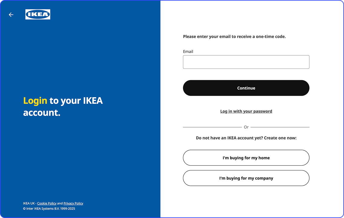
IKEA's login screen is an amazing example of a clean, simple, and user-friendly design. It contains branding elements like logo and brand colors. The most noticeable feature of IKEA's login page is the added convenience and security of the one-time code. Along with the traditional password and email entry, the login page enables users to sign in with a one-time code sent via SMS. It ensures a secure and versatile login experience for IKEA's platform visitors.
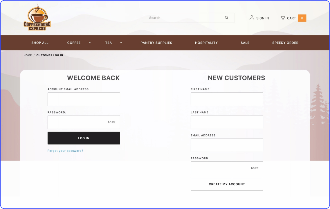
The Coffee House login page reflects a clean and minimalistic design. It features a straightforward form against a light background that is easy to perceive. Also, the login screen has the coffee cup logo at the top, which ties the screen to the brand. The login page is convenient because of its simplicity. Users can navigate the login process quickly and with no extra requirements along the way.
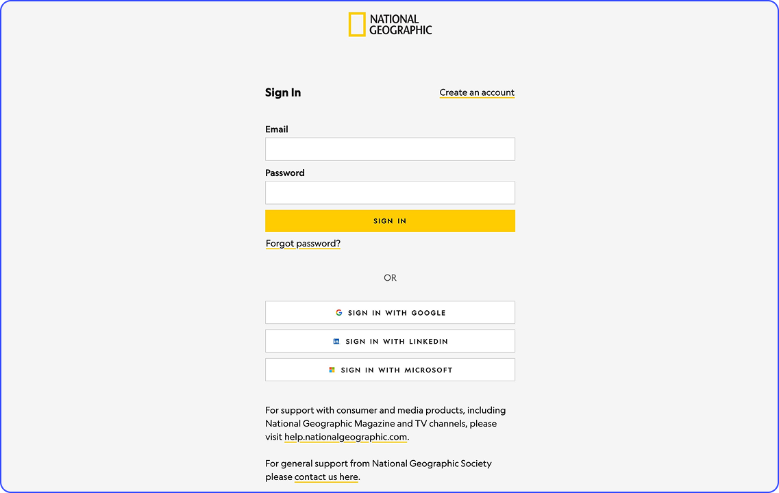
National Geographic's login page is both simple and visually striking, perfectly reflecting the brand's identity. The page features a breathtaking image of the aurora borealis, emphasizing the brand’s deep connection to nature. The use of a title case for headings adds a traditional touch, maintaining a classic and timeless feel. The login process is straightforward, with just one field for entering your email address. The clean, organized design ensures easy navigation, making the login experience seamless and user-friendly.
You are not the first person who will design a login page for a product or service. It has been done before numerous times. So you can gain vital insights about struggles and issues that may arise during the design process.
When designing a login page, avoiding common mistakes is crucial to ensuring a smooth user experience and improving security. Common pitfalls you should pay attention to include a lack of mobile optimization, adding unnecessary fields or options, and ambiguous error messages like "Login failed." Also, failing to implement security measures like two-factor authentication design or SSL encryption can leave users vulnerable. So, prioritize security while balancing usability, and consider offering 2FA options for an added layer of protection.
The latest trends in login page design reflect the increasing focus on user experience, security, and personalization. One notable trend is biometric login authentication, which allows users to log in using facial recognition or fingerprint scanning. This method provides convenience and security, reducing reliance on passwords while improving accessibility for users across various devices.
Another growing trend is single sign-on (SSO) authentication, which enables users to access multiple services with a single login. SSO streamlines the user experience by eliminating the need for multiple credentials and enhances security by consolidating access management. Popular services like Google and Facebook offer SSO options, making logging in quicker and more seamless.
Lastly, the focus on zero-trust security is increasing, where login pages incorporate more robust, multi-layered security measures like adaptive authentication, which assesses user behavior to detect unusual activity.
Login screens are essential gateways to brands. Regardless of what your service or product is about, a well-designed login page enables you to establish a positive first contact with your audience. With the information we’ve shared in this read, you can define your login page design route. By keeping in mind the best practices of login form design and knowing smart login page trends, you can shape an excellent entry experience for users.
The login page design journey requires attention, skills, and, most importantly, time. So, if you want to focus more on your business, you can delegate the design process to the experts. At DreamX, we are always ready to work on new projects, tackle challenges, and contribute to brands’ success. So, don’t hesitate to contact us and get your entry process boosted.
Creating seamless UX isn’t always easy. However, you don’t have to do it alone. At DreamX, we’ve put together a comprehensive guide on UX entry patterns, packed with best practices and sign-in page examples, as well as sign-up, onboarding, and even forgot password flows.
To make it even more practical, we’re also giving you a Figma file with ready-to-use UX patterns - so you can apply them instantly to your product.
So, download the guide, explore the patterns, and start improving your UX today!

Login page design examples & best practices for a smooth UX

Iryna Boboshko is a UX/UI design team lead with a keen eye for detail and a strong understanding of user needs. She spearheads the creation of solutions that bridge creativity and functionality.
Get weekly updates on the newest design stories, case studies and tips right in your mailbox.
No junk or spam. Only useful information. We promise!
